Xenium human breast cancer brain - two samples
Melody Jin
2026-02-18
library(spatstat)
library(jazzPanda)
library(SpatialExperiment)
library(Seurat)
library(ggplot2)
library(data.table)
library(dplyr)
library(glmnet)
library(caret)
library(ComplexUpset)
library(corrplot)
library(gridExtra)
library(patchwork)
library(RColorBrewer)
library(limma)
library(edgeR)
library(speckle)
library(here)
source(here("code/utils.R"))
Load sample1 and sample2 dataset
data_nm = "xenium_hbreast"
sp1 = get_xenium_data(rdata$xhb_r1,
                      mtx_name="cell_feature_matrix",
                      trans_name="transcripts.csv.gz",
                      cells_name="cells.csv.gz" )
sp1$trans_info = sp1$trans_info[sp1$trans_info$qv >=20 &
                                    sp1$trans_info$cell_id != -1 &
                                    !(sp1$trans_info$cell_id %in% sp1$zero_cells), ]

## sample2
sp2 = get_xenium_data(rdata$xhb_r2,
                      mtx_name="cell_feature_matrix",
                      trans_name="transcripts.csv.gz",
                      cells_name="cells.csv.gz" )

sp2$trans_info = sp2$trans_info[sp2$trans_info$qv >=20 &
                                    sp2$trans_info$cell_id != -1 &
                                    !(sp2$trans_info$cell_id %in% sp1$zero_cells), ]
Single cell summary
These summary plots characterise per-cell detection counts and sparsity. We can calculate per-cell and per-gene summary statistics from the counts matrix:
Total detections per cell: sums all transcript counts in each cell.
Proportion of zeroes per cell: fraction of genes not detected in each cell.
Detected genes per cell: number of non-zero genes per cell.
Average expression per gene: mean expression across cells, ignoring zeros.
Each distribution is visualised with histograms and density curves to assess data quality and sparsity.
td_r1 <- colSums(sp1$cm)
pz_r1 <- colMeans(sp1$cm==0)
numgene_r1 <- colSums(sp1$cm!=0)

td_r2 <- colSums(sp2$cm)
pz_r2 <- colMeans(sp2$cm==0)
numgene_r2 <- colSums(sp2$cm!=0)


# Build the entire summary as one string
output <- paste0(
  "\n================= Summary Statistics =================\n\n",
  "--- Sample 1 ---\n",
  make_sc_summary(td_r1, "Total detections per cell:"),
  make_sc_summary(pz_r1, "Proportion of zeroes per cell:"),
  make_sc_summary(numgene_r1, "Detected genes per cell:"),
  "\n--- Sample 2 ---\n",
  make_sc_summary(td_r2, "Total detections per cell:"),
  make_sc_summary(pz_r2, "Proportion of zeroes per cell:"),
  make_sc_summary(numgene_r2, "Detected genes per cell:"),
  "\n========================================================\n"
)

cat(output)
================= Summary Statistics =================

--- Sample 1 ---
Total detections per cell:
  Min: 1.0000 |  1Q: 97.0000 |  Median: 166.0000 |  Mean: 192.9693 |  3Q: 263.0000 |  Max: 1359.0000
Proportion of zeroes per cell:
  Min: 0.3802 |  1Q: 0.7476 |  Median: 0.7955 |  Mean: 0.7963 |  3Q: 0.8466 |  Max: 0.9968
Detected genes per cell:
  Min: 1.0000 |  1Q: 48.0000 |  Median: 64.0000 |  Mean: 63.7426 |  3Q: 79.0000 |  Max: 194.0000

--- Sample 2 ---
Total detections per cell:
  Min: 1.0000 |  1Q: 38.0000 |  Median: 63.0000 |  Mean: 89.7103 |  3Q: 101.0000 |  Max: 1487.0000
Proportion of zeroes per cell:
  Min: 0.4826 |  1Q: 0.8160 |  Median: 0.8646 |  Mean: 0.8583 |  3Q: 0.9062 |  Max: 0.9965
Detected genes per cell:
  Min: 1.0000 |  1Q: 27.0000 |  Median: 39.0000 |  Mean: 40.8172 |  3Q: 53.0000 |  Max: 149.0000

========================================================
td_df = as.data.frame(rbind(cbind(as.vector(td_r1),rep("sample1", length(td_r1))),
cbind(as.vector(td_r2),rep("sample2", length(td_r2)))))
colnames(td_df) = c("td","sample")
td_df$td= as.numeric(td_df$td)
p1<-ggplot(data = td_df, aes(x = td, color=sample)) +
geom_histogram(aes(y = after_stat(density)),
binwidth = 50, fill = "gray", color = "black") +
geom_density(color = "steelblue", size = 2) +
facet_wrap(~sample)+
labs(title = "Distribution of total detections per cell",
x = " ", y = "Density") +
#xlim(0, 1000) +
theme_minimal() +
theme(plot.title = element_text(hjust = 0.5),
strip.text = element_text(size=12))
pz = as.data.frame(rbind(cbind(as.vector(pz_r1),rep("sample1", length(pz_r1))),
cbind(as.vector(pz_r2),rep("sample2", length(pz_r2)))))
colnames(pz) = c("prop_ze","sample")
pz$prop_ze= as.numeric(pz$prop_ze)
p2<-ggplot(data = pz, aes(x = prop_ze, color=sample)) +
geom_histogram(aes(y = after_stat(density)),
binwidth = 0.05, fill = "gray", color = "black") +
geom_density(color = "steelblue", size = 2) +
facet_wrap(~sample)+
labs(title = "Distribution of proportion of zeroes per cell",
x = " ", y = "Density") +
#xlim(0, 1) +
theme_minimal() +
theme(plot.title = element_text(hjust = 0.5),
strip.text = element_text(size=12))
numgens = as.data.frame(rbind(cbind(as.vector(numgene_r1),rep("sample1", length(numgene_r1))),
cbind(as.vector(numgene_r2),rep("sample2", length(numgene_r2)))))
colnames(numgens) = c("numgen","sample")
numgens$numgen= as.numeric(numgens$numgen)
p3<-ggplot(data = numgens, aes(x = numgen, color=sample)) +
geom_histogram(aes(y = after_stat(density)),
binwidth = 10, fill = "gray", color = "black") +
geom_density(color = "steelblue", size = 2) +
facet_wrap(~sample)+
labs(title = "Distribution of detected genes per cell",
x = " ", y = "Density") +
theme_minimal() +
theme(plot.title = element_text(hjust = 0.5),
strip.text = element_text(size=12))cm_new1=sp1$cm
cm_new1[cm_new1==0] = NA
cm_new1 = as.data.frame(cm_new1)
cm_new1$avg2 = rowMeans(cm_new1,na.rm = TRUE)
summary(cm_new1$avg2) Min. 1st Qu. Median Mean 3rd Qu. Max.
1.02 1.34 1.71 2.13 2.38 13.50 cm_new2=sp2$cm
cm_new2[cm_new2==0] = NA
cm_new2 = as.data.frame(cm_new2)
cm_new2$avg2 = rowMeans(cm_new2,na.rm = TRUE)
summary(cm_new2$avg2) Min. 1st Qu. Median Mean 3rd Qu. Max.
1.01 1.24 1.45 1.82 1.90 13.43 avg_exp = as.data.frame(cbind("avg"=c(cm_new1$avg2, cm_new2$avg2),
"sample"=c(rep("sample1", nrow(sp1$cm)),
rep("sample2", nrow(sp1$cm)))))
avg_exp$avg=as.numeric(avg_exp$avg)
avg_exp$sample = factor(avg_exp$sample,
levels = c("sample1", "sample2"))
p4<-ggplot(data = avg_exp, aes(x = avg, color=sample)) +
geom_histogram(aes(y = after_stat(density)),
binwidth = 1, fill = "gray", color = "black") +
geom_density(color = "orange", linewidth = 1) +
facet_wrap(~sample)+
labs(title = "Distribution of average gene expression per cell",
x = " ", y = "Density") +
#xlim(0, 1) +
theme_minimal() +
theme(plot.title = element_text(hjust = 0.5),
strip.text = element_text(size=12))
layout_design <- (p1|p2)/(p3|p4)
layout_design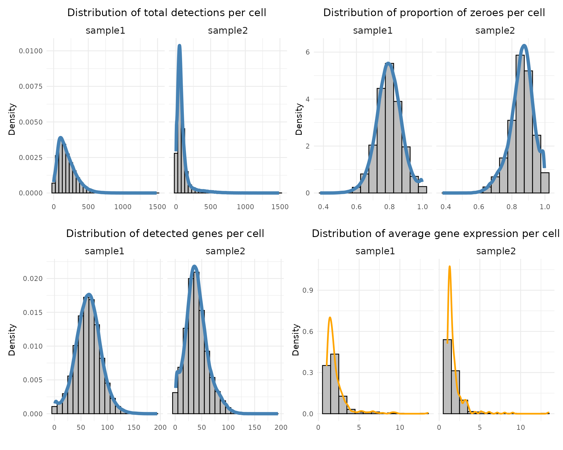
Both samples show similar overall distribution shapes across metrics. Sample 1 has higher transcript detection, with a median of 166 total counts and 64 detected genes per cell, while sample 2 shows lower detection levels (median 63 counts and 39 genes). The proportion of zeroes is high in both datasets (around 0.80 for sample 1 and 0.86 for sample 2). Average gene expression per cell is strongly right-skewed, indicating that most genes are expressed at low levels (median 1.71 in sample 1 and 1.45 in sample 2).
Quality assessment of negative controls
Negative control probes
Negative control probes are non-targeting probes designed not to hybridize to any transcript. There are 28 negative control probe targets in sample 1 and 20 in sample 2. In sample 1, the detection counts range from 110 to 12,975, with a median of 382, while in sample 2 they range from 15 to 86, with a median of 45. Notably, the probe antisense_PROKR2 shows a particularly high detection count (12,975) exclusively in sample 1.
probe_coords <- dplyr::bind_rows(
  sp1$trans_info %>%
    filter(feature_name %in% sp1$probe) %>%
    select(feature_name, x, y) %>%
    mutate(sample = "sample1"),

  sp2$trans_info %>%
    filter(feature_name %in% sp2$probe) %>%
    select(feature_name, x, y) %>%
    mutate(sample = "sample2")
)

ordered_feature = probe_coords %>% group_by(feature_name) %>% count() %>% arrange(desc(n))%>% pull(feature_name)
probe_tb = as.data.frame(probe_coords %>% group_by(sample, feature_name) %>% count())
colnames(probe_tb) = c("sample","feature_name","value_count")
probe_tb$feature_name = factor(probe_tb$feature_name, levels= ordered_feature)

probe_tb = probe_tb[order(probe_tb$feature_name), ]

p1<- ggplot(probe_tb, aes(x = feature_name, y = value_count)) +
    geom_bar(stat = "identity", position = position_dodge()) +
    facet_wrap(~sample, ncol=2, scales = "free")+
    labs(title = " ", x = " ", y = "Number of total detections") +
    theme_bw()+
    theme(legend.position = "none",
          axis.text.x= element_text(size=8, angle=45,vjust=1,hjust = 1),
          aspect.ratio = 5/7,
          axis.text.y=element_text(size=8),
          axis.ticks=element_blank(),
          axis.title.x=element_blank(),
          strip.background = element_rect(fill="white", colour="black"),
          panel.background=element_blank(),
          panel.grid.minor=element_blank(),
          plot.background=element_blank())

p1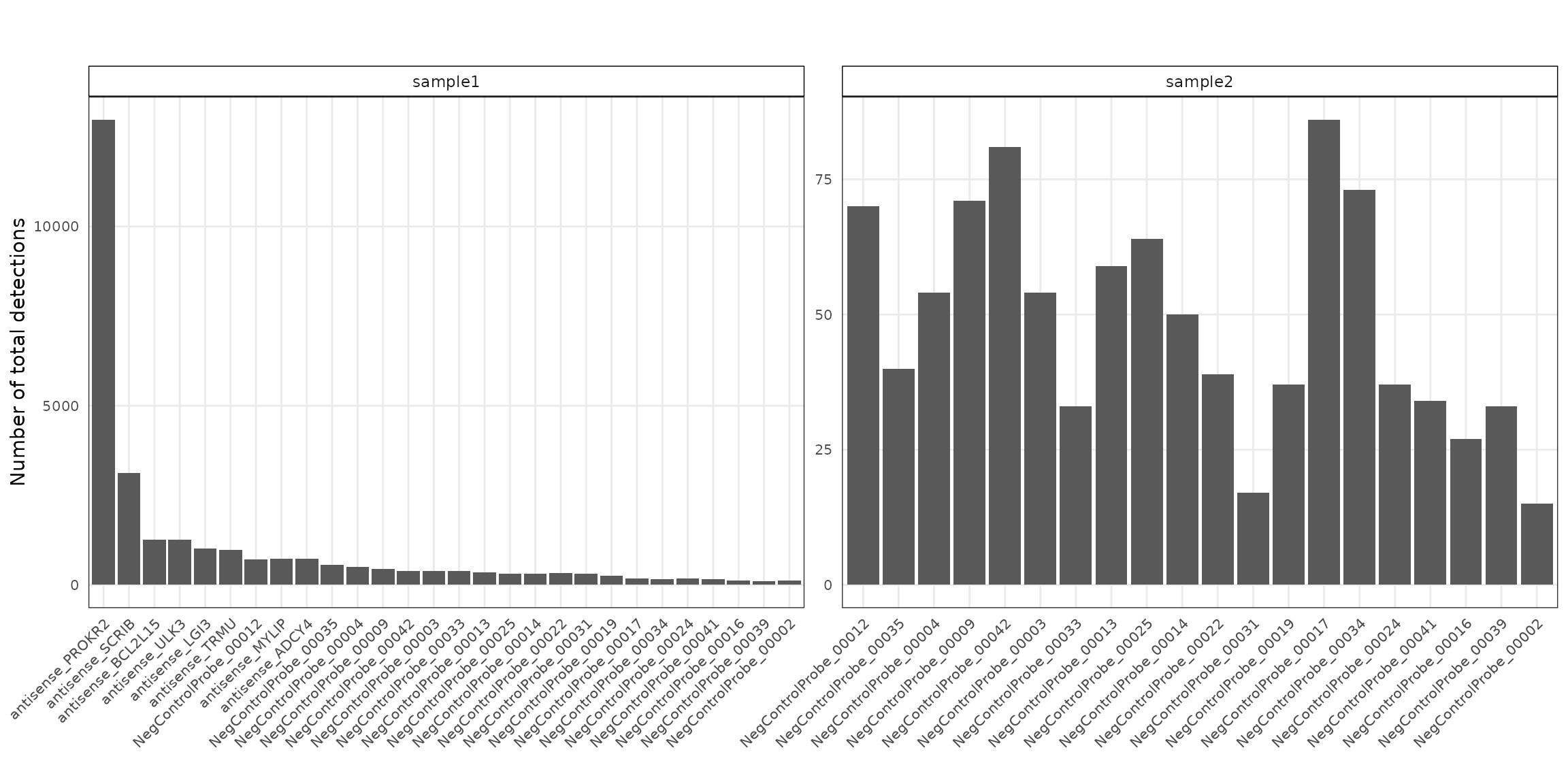
p1<-ggplot(probe_coords, aes(x = x, y = y)) +
            geom_hex(bins = auto_hex_bin(min(table(probe_coords$sample)),
                                         target_points_per_bin = 1)) +
            theme_bw() +
            scale_fill_gradient(low = "white", high = "black") +
            guides(fill = guide_colorbar(barheight = unit(0.06, "npc"),
                                         barwidth  = unit(0.4, "npc"),
                                         )) +
            scale_x_reverse()+
            facet_wrap(~sample, ncol=2) +
            defined_theme +
            theme(legend.title = element_text(size = 10,
                                              hjust = 1, vjust=0.8),
                legend.position = "bottom",
                aspect.ratio = 7/10,
                legend.text = element_text(size = 9),
                strip.text = element_text(size = 12),
                strip.background = element_blank())

p1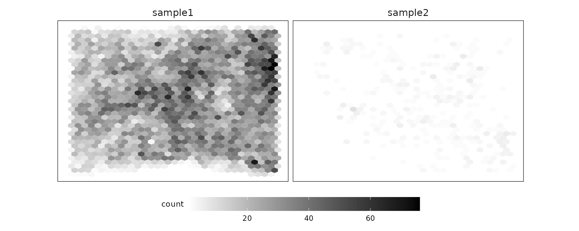
Negative control codewords
Negative control codewords are unused barcode sequences included to detect random or erroneous decoding events, providing a measure of decoding noise. In this dataset, 41 negative codeword targets were used, with median detection counts of about 46 in sample 1 and 6 in sample 2. There are no particular localised spatial patterns for these codeword targets.
codeword_coords <- dplyr::bind_rows(
  sp1$trans_info %>%
    filter(feature_name %in% sp1$codeword) %>%
    select(feature_name, x, y) %>%
    mutate(sample = "sample1"),

  sp2$trans_info %>%
    filter(feature_name %in% sp2$codeword) %>%
    select(feature_name, x, y) %>%
    mutate(sample = "sample2")
)


ordered_feature = codeword_coords %>%
    group_by(feature_name) %>%
    count() %>%
    arrange(desc(n)) %>% pull(feature_name)
codeword_tb = as.data.frame(codeword_coords %>%
                                group_by(sample, feature_name) %>%
                                count())
colnames(codeword_tb) = c("sample","feature_name","value_count")
codeword_tb$feature_name = factor(codeword_tb$feature_name, levels= ordered_feature)

codeword_tb = codeword_tb[order(codeword_tb$feature_name), ]

p2<- ggplot(codeword_tb, aes(x = feature_name, y = value_count)) +
    geom_bar(stat = "identity", position = position_dodge()) +
    facet_wrap(~sample, ncol=2, scales = "free")+
    labs(title = " ", x = " ", y = "Number of total detections") +
    theme_bw()+
    theme(legend.position = "none",
          axis.text.x= element_text(size=8, angle=45,vjust=1,hjust = 1),
          aspect.ratio = 5/7,
          axis.text.y=element_text(size=8),
          axis.ticks=element_blank(),
          axis.title.x=element_blank(),
          strip.background = element_rect(fill="white", colour ="black"),
          panel.background=element_blank(),
          panel.grid.minor=element_blank(),
          plot.background=element_blank())

p2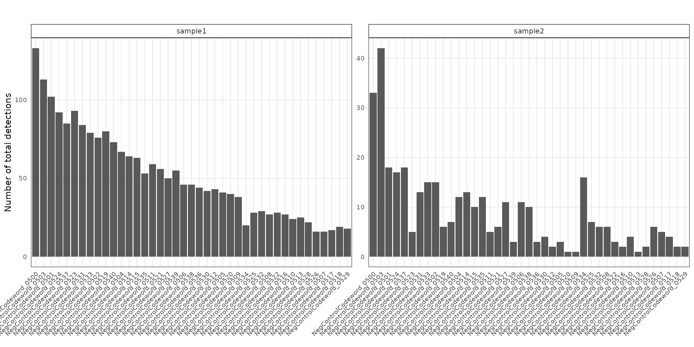
p2<- ggplot(codeword_coords, aes(x = x, y = y)) +
            geom_hex(bins = auto_hex_bin(min(table(probe_coords$sample)),
                                         target_points_per_bin = 1)) +
            theme_bw() +
            scale_fill_gradient(low = "white", high = "black") +
            guides(fill = guide_colorbar(barheight = unit(0.06, "npc"),
                                         barwidth  = unit(0.4, "npc"),
                                         )) +
            scale_x_reverse()+
            facet_wrap(~sample, ncol=2) +
            defined_theme +
            theme(legend.title = element_text(size = 10, hjust = 1, vjust=0.8),
                legend.position = "bottom",
                aspect.ratio = 7/10,
                legend.text = element_text(size = 9),
                strip.text =  element_text(size = 12),
                strip.background = element_blank())

p2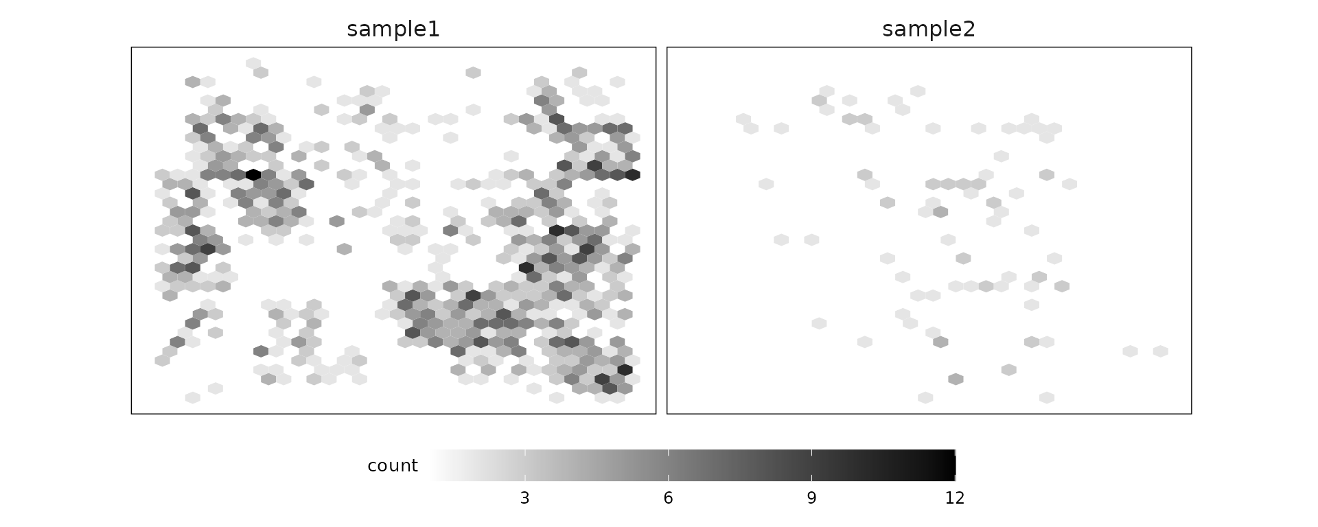
Clustering
We process the two samples separately, and align them based on the shared cell types. For sample 1, we used the provided cell type labels and refined them by collapsing subtypes. For sample 2, we perform Louvain clustering with resolution 0.5, and annotate the resulting clusters with known marker genes. This process produced 14 cell types for sample 2, which were then grouped into broader categories for alignment with sample 1. Finally, cells from nine shared cell types in each sample were joined, and a cluster label (c1-c9) was created for representing each of the cell type.
project_root="/path/to/jazzPanda_paper/dir"

graphclust_sp1=read.csv(file.path(project_root, "data", "Xenium_rep1_supervised_celltype.csv"))
graphclust_sp1$anno =as.character(graphclust_sp1$Cluster)
target_clusters = c("Tumor", "Stromal","Macrophages","Myoepithelial",
                    "T_Cells", "B_Cells","Endothelial", "Dendritic", "Mast_Cells")

t_cells =  c("CD4+_T_Cells","CD8+_T_Cells","T_Cell_&_Tumor_Hybrid",
             "Stromal_&_T_Cell_Hybrid")
dc_cells = c("LAMP3+_DCs","IRF7+_DCs")
macro_cells = c("Macrophages_1","Macrophages_2")
myo_cells = c("Myoepi_KRT15+", "Myoepi_ACTA2+")
tumor_cells = c("Invasive_Tumor", "Prolif_Invasive_Tumor")
graphclust_sp1[graphclust_sp1$Cluster %in% t_cells, "anno"] = "T_Cells"
graphclust_sp1[graphclust_sp1$Cluster %in% macro_cells,"anno"] = "Macrophages"
graphclust_sp1[graphclust_sp1$Cluster %in% c("DCIS_1", "DCIS_2"),"anno"] = "DCIS"
graphclust_sp1[graphclust_sp1$Cluster %in% dc_cells,"anno"] = "Dendritic"
graphclust_sp1[graphclust_sp1$Cluster %in% myo_cells,"anno"] = "Myoepithelial"
graphclust_sp1[graphclust_sp1$Cluster %in% tumor_cells,"anno"] = "Tumor"

graphclust_sp1$anno=factor(graphclust_sp1$anno,
                           levels=c("Tumor", "DCIS", "Stromal",
                                    "Macrophages","Myoepithelial",
                                    "T_Cells", "B_Cells",
                                    "Endothelial",
                                    "Dendritic", "Mast_Cells",
                                    "Perivascular-Like","Unlabeled"))


sp1_clusters = as.data.frame(cbind(as.character(graphclust_sp1$anno),
                                   paste("c",as.numeric(factor(graphclust_sp1$anno)),
                                         sep="")))

row.names(sp1_clusters) = graphclust_sp1$Barcode
colnames(sp1_clusters) = c("anno","cluster")

cells= sp1$cell_info
row.names(cells) =cells$cell_id
rp_names =  row.names(sp1_clusters)
sp1_clusters[rp_names,"x"] = cells[match(rp_names,row.names(cells)),
                                   "x"]
sp1_clusters[rp_names,"y"] = cells[match(rp_names,row.names(cells)),
                                   "y"]

sp1_clusters$anno=factor(sp1_clusters$anno,
                         levels=c("Tumor", "DCIS", "Stromal",
                                  "Macrophages","Myoepithelial",
                                  "T_Cells", "B_Cells",
                                  "Endothelial",
                                  "Dendritic", "Mast_Cells",
                                  "Perivascular-Like","Unlabeled"))
sp1_clusters$cluster=factor(sp1_clusters$cluster,
                            levels=paste("c", 1:12, sep=""))

sp1_clusters$cells =paste(row.names(sp1_clusters),"_1",sep="")
sp1_clusters$sample="sample1"
selected_sp1 = sp1_clusters
selected_sp1$cluster_comb = as.character(selected_sp1$anno)
selected_sp1[selected_sp1$cluster_comb =="DCIS","cluster_comb"]  = "Tumor"
selected_sp1 = selected_sp1[selected_sp1$cluster_comb %in% target_clusters,]
selected_sp1$cluster_comb = factor(selected_sp1$cluster_comb, levels=target_clusters)
selected_sp1$cluster =paste("c",as.numeric(factor(selected_sp1$cluster_comb)),
                            sep="")
selected_sp1 = selected_sp1[,c("cluster","x","y","cells","sample","cluster_comb")]
colnames(selected_sp1)[6]="anno"

sample2_anno = read.csv(file.path(project_root, "data", "Sample2_Xenium_cell_type_manual.csv"),
                        row.names = 1)
sp2_clusters = as.data.frame(cbind(row.names(sample2_anno),
                                   as.character(sample2_anno$cell_type)))
colnames(sp2_clusters) = c("cells","anno")
row.names(sp2_clusters) = sp2_clusters$cells
cells= sp2$cell_info
row.names(cells) = cells$cell_id
rp_names = sp2_clusters$cells
sp2_clusters[rp_names,"x"] = cells[match(rp_names,row.names(cells)),
                                   "x"]
sp2_clusters[rp_names,"y"] = cells[match(rp_names,row.names(cells)),
                                   "y"]

sp2_clusters$sample="sample2"

sp2_clusters[sp2_clusters$anno %in% c("B", "Plasma"),"anno"]="B_Cells"
sp2_clusters[sp2_clusters$anno %in% c("Macrophage"),"anno"]="Macrophages"
sp2_clusters[sp2_clusters$anno %in% c("T","NK"),"anno"]="T_Cells"
sp2_clusters[sp2_clusters$anno %in% c("Fibroblast"),"anno"]="Stromal"
sp2_clusters[sp2_clusters$anno %in% c("Mast"),"anno"]="Mast_Cells"
sp2_clusters$anno = factor(sp2_clusters$anno,
                           levels=c("Tumor", "Stromal","Macrophages",
                                    "Myoepithelial", "T_Cells", "B_Cells",
                                    "Endothelial", "Dendritic", "Mast_Cells",
                                    "ML","LP","Adipocyte"))

sp2_clusters$cells=paste(sp2_clusters$cells,"-sp2", sep="")


sp2_clusters$anno = as.character(sp2_clusters$anno)
selected_sp2 = sp2_clusters[sp2_clusters$anno %in% target_clusters,]

selected_sp2$anno = factor(selected_sp2$anno, levels=target_clusters)
selected_sp2$cluster =paste("c",as.numeric(factor(selected_sp2$anno)),
                            sep="")

selected_sp2 = selected_sp2[,c("cluster","x","y","cells","sample","anno")]
clusters = rbind(selected_sp1, selected_sp2)
table(clusters$sample, clusters$anno)
clusters$anno = factor(clusters$anno, target_clusters)


saveRDS(cluster_info, here(gdata,paste0(data_nm, "_clusters.Rds")))
xhb_color<- c("#FC8D62","#66C2A5" ,"#8DA0CB","#E78AC3",
"#A6D854","skyblue","purple3","#E5C498","blue")
# load generated data (see code above for how they were created)
cluster_info = readRDS(here(gdata,paste0(data_nm, "_clusters.Rds")))
colnames(cluster_info)[6] = "anno_name"
cluster_names = paste0("c", 1:9)
cluster_info$cluster = factor(cluster_info$cluster,
levels=cluster_names)
ct_names =c("Tumor", "Stromal","Macrophages","Myoepithelial", "T_Cells",
"B_Cells","Endothelial", "Dendritic", "Mast_Cells")
cluster_info$anno_name = factor(cluster_info$anno_name,
levels=ct_names)
cluster_info = cluster_info[order(cluster_info$anno_name), ]
cluster_info$cells = paste0("_", cluster_info$cells)
anno_df = unique(cluster_info[c("cluster", "anno_name")])
anno_df$anno_name = factor(anno_df$anno_name, levels = ct_names)We can see that While both samples contain the same major cell types, their relative proportions differ markedly. Sample 1 is dominated by tumor and stromal cells, which together account for more than 65% of cells. In contrast, sample 2 shows a lower tumor and stromal fraction but a clear increase in immune and vascular components. Notably, T cells are more than twice as abundant in sample 2, accompanied by higher proportions of B cells, endothelial cells, dendritic cells, and mast cells.
sum_df = cluster_info[,c("anno_name", "cells","sample"),drop=FALSE] %>%
    group_by(anno_name, sample) %>% dplyr::count()

ggplot(sum_df, aes(x = sample, y = n, fill=anno_name)) +
  geom_bar( stat="identity",position="fill") +
  scale_y_continuous(labels = scales::percent)+
  labs(title = " ", x = " ", y = "proportion of cell types", fill="cell types") +

     scale_fill_manual(values =xhb_color)+
   theme(legend.position = "right",axis.text.x= element_text(size=12),
         strip.text = element_text(size = rel(1)),
          axis.line=element_blank(),
               axis.text.y=element_blank(),axis.ticks=element_blank(),
               axis.title.x=element_blank(),
               axis.title.y=element_blank(),
               panel.background=element_blank(),
               panel.grid.major=element_blank(),
               panel.grid.minor=element_blank(),
         plot.background=element_blank())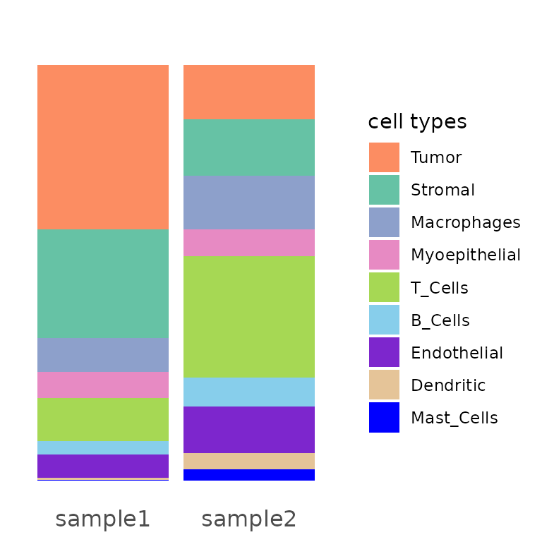
ggplot(data = cluster_info,
        aes(x = x, y = y, color=cluster))+
        geom_point(size=0.001)+
        facet_wrap(~sample, nrow=1)+
        theme_classic()+
        scale_y_reverse()+
        scale_color_manual(values =xhb_color)+
        guides(color=guide_legend(title="cluster", ncol = 1,
        override.aes=list(alpha=1, size=8)))+ defined_theme+
        theme(strip.background = element_rect(color="white"),
                legend.position = "right",legend.key.width = unit(1, "cm"),
                aspect.ratio = 5/7,
                legend.title = element_text(size = 12),
                legend.text = element_text(size = 12),
                legend.key.height = unit(1, "cm"),
                strip.text = element_text(size = rel(2.2)))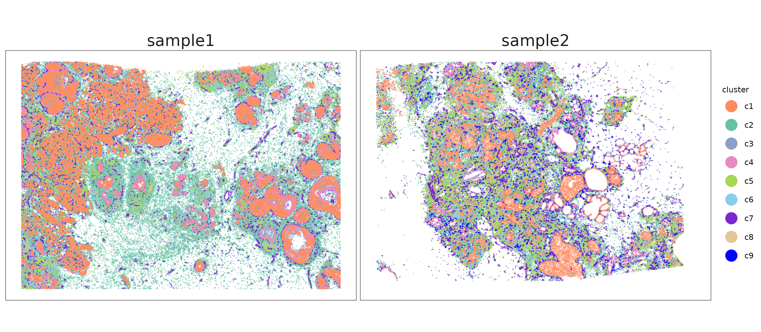
The clusters show distinct and largely non-overlapping spatial patterns. We can see that the corresponding clusters in sample 1 and sample 2 differ in their spatial arrangement, reflecting heterogeneity in tissue structures.
p1<- ggplot(data = cluster_info[cluster_info$sample=="sample1", ],
        aes(x = x, y = y, color=cluster))+
        geom_point(size=0.001)+
        facet_wrap(~cluster, ncol=3)+
        scale_y_reverse()+
        scale_color_manual(values = xhb_color)+
        theme_classic()+
        guides(color=guide_legend(title="cluster",
                                  override.aes=list(alpha=1, size=8)))+
        theme_minimal()+
        defined_theme+
        labs(title = "Sample1")+
        theme(aspect.ratio = 5/7,
              plot.title = element_text(size = rel(1.6)),
              strip.text = element_text(size = rel(1.2)))


p2<- ggplot(data = cluster_info[cluster_info$sample=="sample2", ],
        aes(x = x, y = y, color=cluster))+
        geom_point(size=0.001)+
        facet_wrap(~cluster, ncol=3)+
        scale_y_reverse()+
        scale_color_manual(values = xhb_color)+
        theme_classic()+
        guides(color=guide_legend(title="cluster",
                                  override.aes=list(alpha=1, size=8)))+
        theme_minimal()+
        defined_theme+
        labs(title = "Sample2")+

        theme(aspect.ratio = 5/7,
              plot.title = element_text(size = rel(1.6)),
              strip.text = element_text(size = rel(1.2)))

layout_design <- p1 / p2
layout_design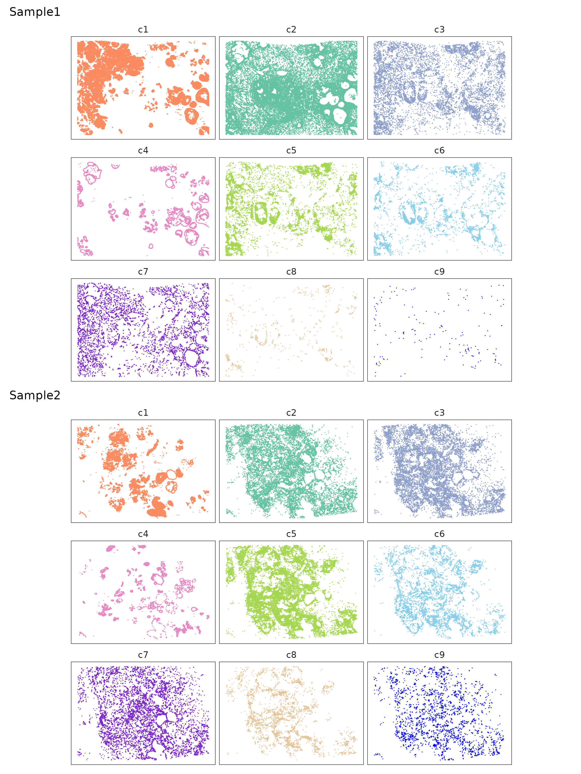
Find shared marker genes for sample1 and sample2
jazzPanda
We applied jazzPanda to this dataset using the linear modelling approach to detect spatially enriched marker genes across clusters. The dataset was converted into spatial gene and cluster vectors using a 40 × 40 square binning strategy. Transcript detections for the negative control probes and codewords targets were included as the background control. For each gene, a linear model was fitted to estimate its spatial association with relevant cell type patterns.
shared_genes = intersect(row.names(sp1$cm), row.names(sp2$cm))
seed_number= 589

grid_length=40
keep_targets = c(shared_genes,
                 intersect(sp1$probe,sp2$probe),
                 intersect(sp1$codeword,sp2$codeword))

sp1_sp2_vectors = get_vectors(x= list("sample1" = sp1$trans_info,
                                      "sample2" = sp2$trans_info),
                              sample_names = c("sample1", "sample2"),
                              cluster_info = cluster_info, bin_type="square",
                              bin_param=c(grid_length,grid_length),
                              test_genes = shared_genes,
                              n_cores = 5)
})
sp1_sp2_nc_vectors = create_genesets(x= list("sample1" = sp1$trans_info,
                                             "sample2" = sp2$trans_info),
                                     sample_names = c("sample1", "sample2"),
                                     name_lst=list(probe=intersect(sp1$probe,sp2$probe),
                                                   codeword=intersect(sp1$codeword,sp2$codeword)),
                                     bin_type="square",
                                     bin_param=c(40,40),
                                     cluster_info = NULL)

set.seed(seed_number)

sp1_sp2_lasso_with_nc = lasso_markers(gene_mt=sp1_sp2_vectors$gene_mt,
                                      cluster_mt = sp1_sp2_vectors$cluster_mt,
                                      sample_names=c("sample1","sample2"),
                                      keep_positive=TRUE,
                                      background=sp1_sp2_nc_vectors)

saveRDS(all_vectors, here(gdata,paste0(data_nm, "_sq50_vector_lst.Rds")))
saveRDS(jazzPanda_res_lst, here(gdata,paste0(data_nm, "_jazzPanda_res_lst.Rds")))
We then used get_top_mg to extract unique marker genes
for each cluster based on a coefficient cutoff of 0.1. This function
returns the top spatially enriched genes that are most specific to each
cluster. In contrast, if shared marker genes across clusters are of
interest, all significant genes can be retrieved using
get_full_mg.
# load generated data  (see code above for how they were created)

jazzPanda_res_lst = readRDS(here(gdata,paste0(data_nm, "_jazzPanda_res_lst.Rds")))
sv_lst = readRDS(here(gdata,paste0(data_nm, "_sq40_vector_lst.Rds")))
nbins = 1600
jazzPanda_res = get_top_mg(jazzPanda_res_lst, coef_cutoff=0.1)
jazzPanda_summary = as.data.frame(table(jazzPanda_res$top_cluster))
colnames(jazzPanda_summary) = c("cluster","jazzPanda_glm")

seu = readRDS(here(gdata,paste0(data_nm, "_seu.Rds")))
seu <- subset(seu, cells = cluster_info$cells)
Idents(seu)=cluster_info$cluster[match(colnames(seu), cluster_info$cells)]
Idents(seu) = factor(Idents(seu), levels = cluster_names)
seu$sample = cluster_info$sample[match(colnames(seu), cluster_info$cells)]
glm_mg = jazzPanda_res[jazzPanda_res$top_cluster != "NoSig", ]
glm_mg$top_cluster = factor(glm_mg$top_cluster, levels = cluster_names)
top_mg_glm <- glm_mg %>%
group_by(top_cluster) %>%
arrange(desc(glm_coef), .by_group = TRUE) %>%
slice_max(order_by = glm_coef, n = 10) %>%
select(top_cluster, gene, glm_coef)
p1<-DotPlot(seu, features = top_mg_glm$gene) +
scale_colour_gradient(low = "white", high = "red") +
coord_flip()+
theme(axis.text.x = element_text(angle = 45, hjust = 1, vjust = 1))+
labs(title = "Top 10 marker genes (jazzPanda-glm)", x="", y="")
p1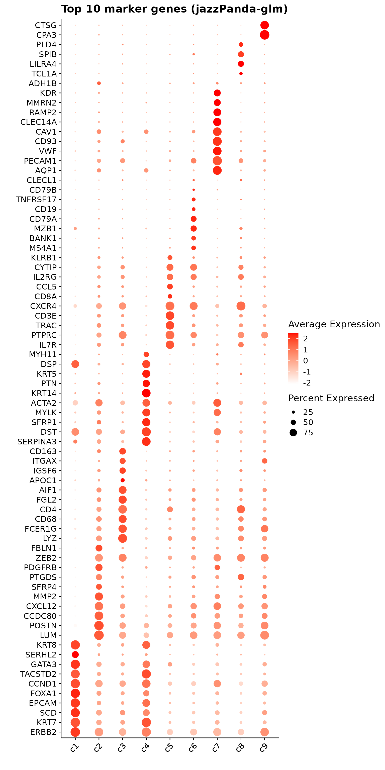
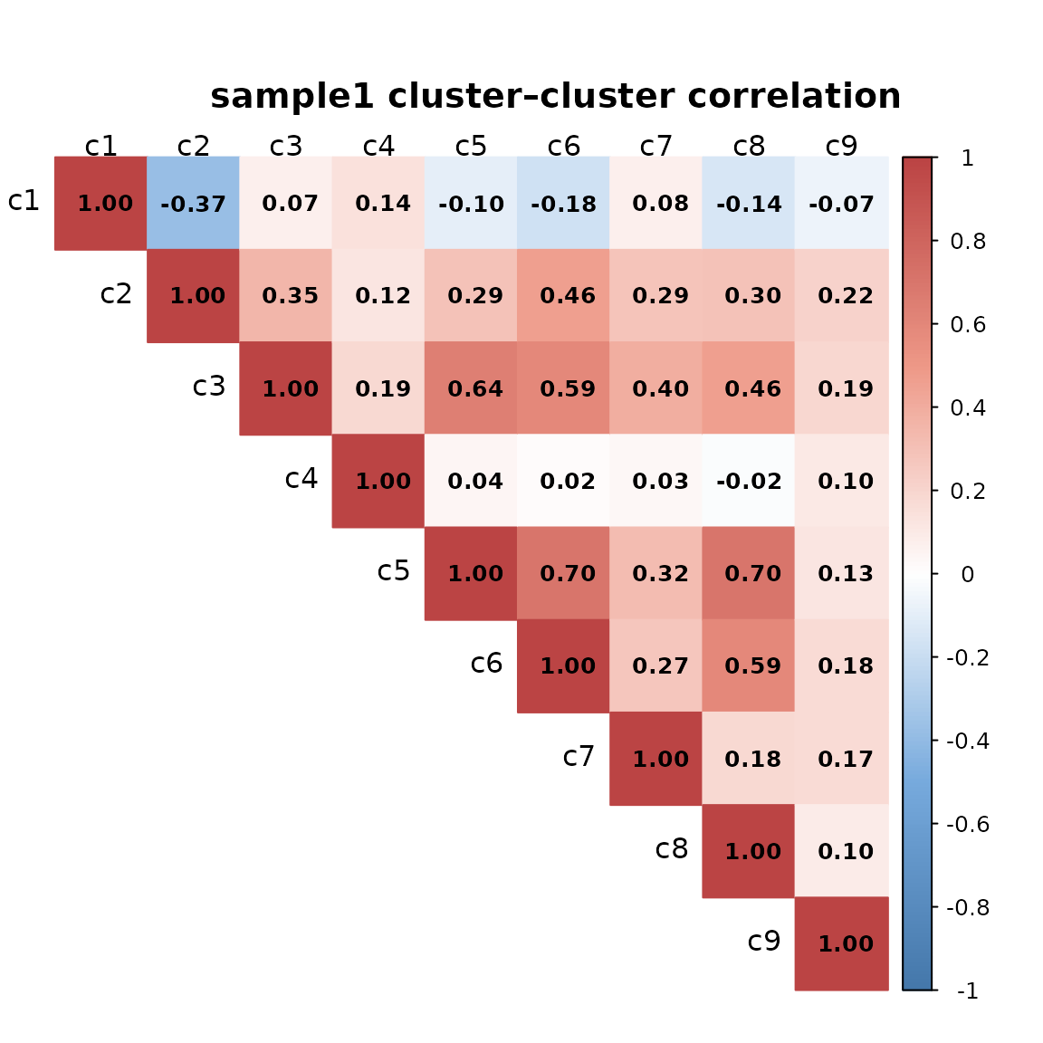
Cluster to cluster correlation
We computed pairwise Pearson correlations between spatial cluster vectors to assess relationships among cell type distribution for every sample.
The cluster–cluster correlation matrices reveal both shared and sample-specific structures. In sample 1, cluster 1 (c1) shows weak to negative correlations with other clusters (notably –0.37 with c2 and –0.18 with c6), whereas in sample 2, these relationships become largely neutral, indicating sample-dependent behavior of c1. In contrast, clusters 2–3–5–6 exhibit consistent positive correlations across both samples, with c3–c5–c6 forming a stable, strongly associated module. Clusters 5–8 also display coherent interrelations whereas c4 and c9 remain generally independent in both datasets. Overall, while correlation magnitudes are higher in sample 2, the relative cluster–cluster relationships are largely preserved, implying that the underlying biological organization is stable but expressed with varying coherence across sample
for (curr_sp in c("sample1", "sample2")){

    cluster_mtt <- sv_lst$cluster_mt[sv_lst$cluster_mt[, curr_sp] == 1, ]
    cluster_mtt <- cluster_mtt[, cluster_names]
    cor_M_cluster <- cor(cluster_mtt, cluster_mtt, method = "pearson")

    col <- colorRampPalette(c("#4477AA", "#77AADD", "#FFFFFF",
                              "#EE9988", "#BB4444"))

    corrplot(cor_M_cluster,
            method = "color",
            col = col(200),
            diag = TRUE,
            addCoef.col = "black",
            type = "upper",
            tl.col = "black",
            tl.cex = 1,
            number.cex = 0.8,
            tl.srt = 0,
            mar = c(0, 0, 3, 0),
            sig.level = 0.05,
            insig = "blank")

    title(paste(curr_sp, "cluster–cluster correlation"),
            line = 1,
            cex.main = 1.2)

}
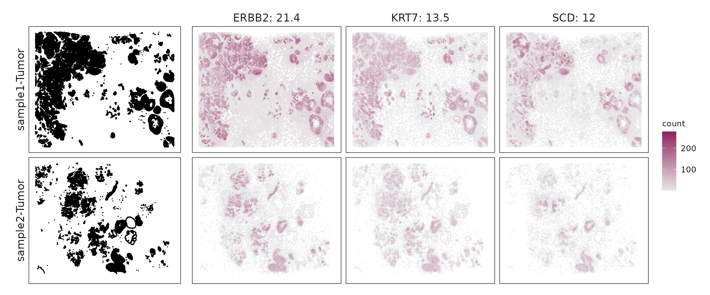
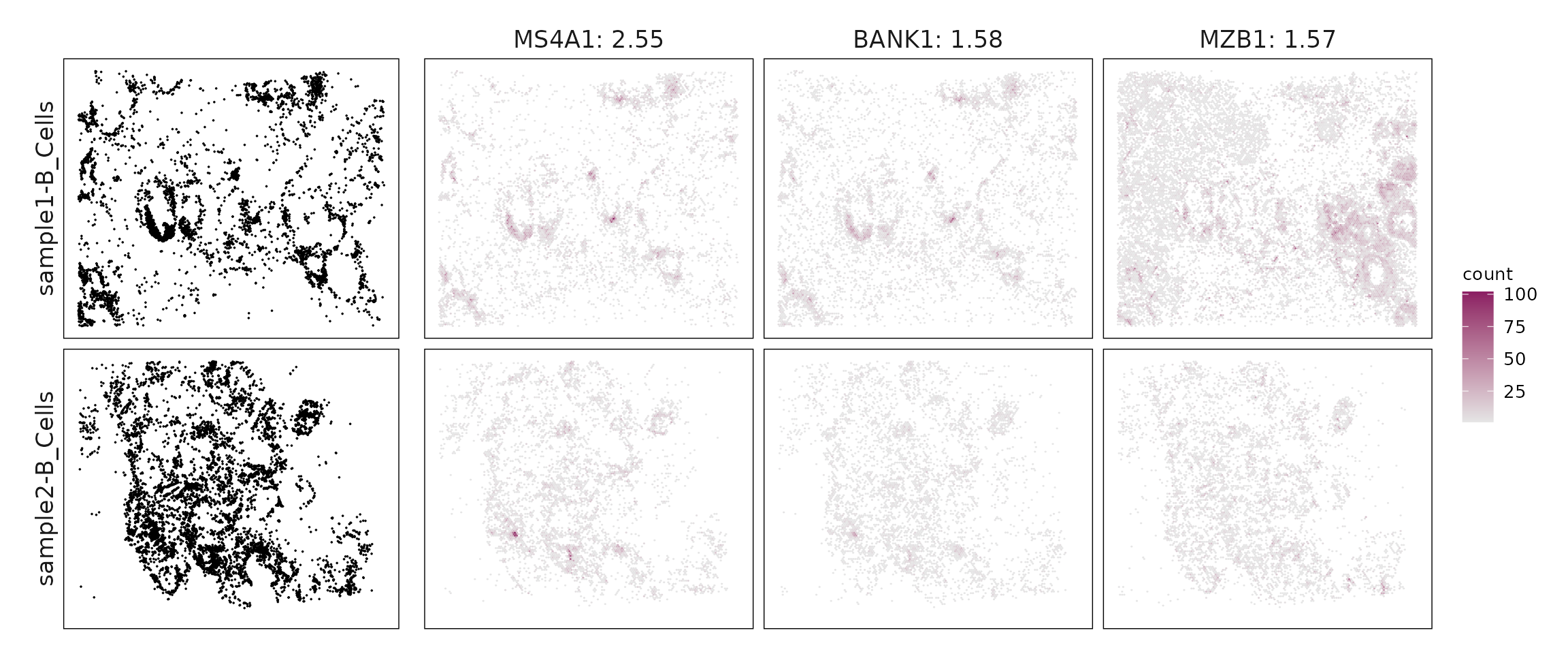
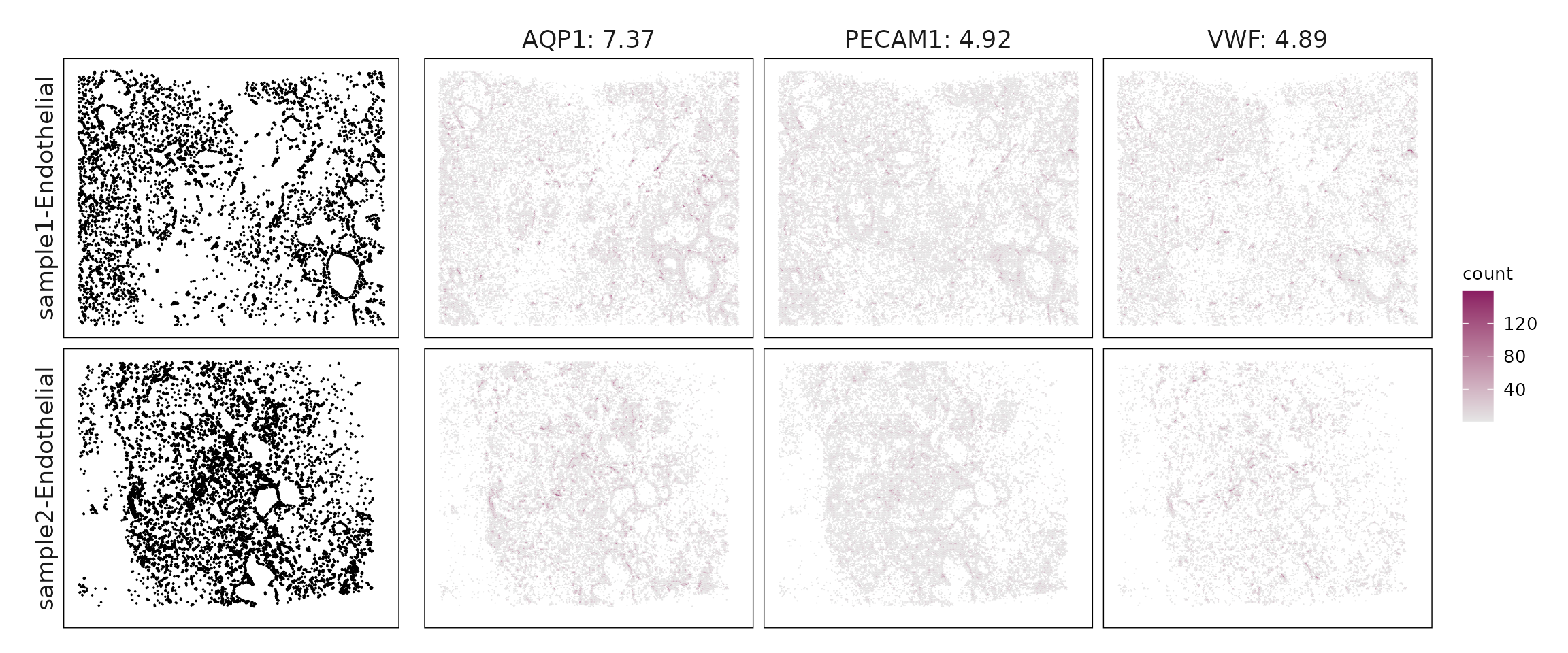
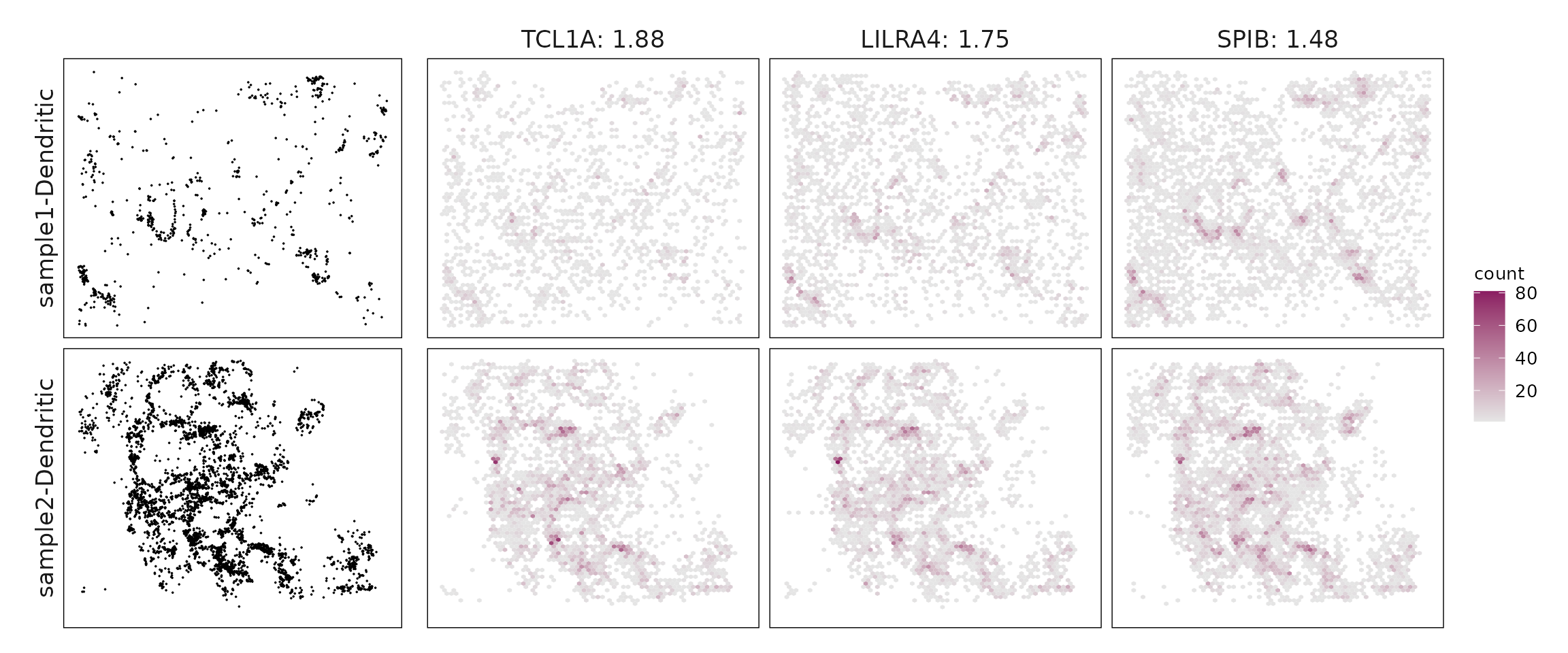
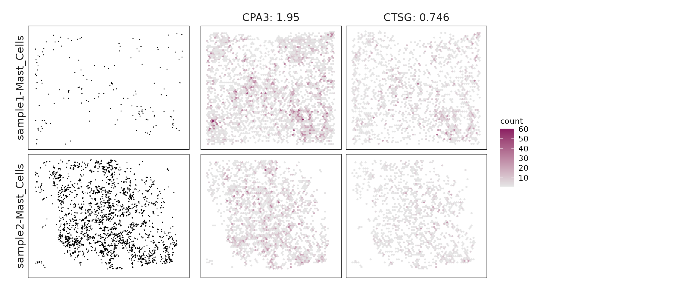
Top3 marker genes by jazzPanda_glm
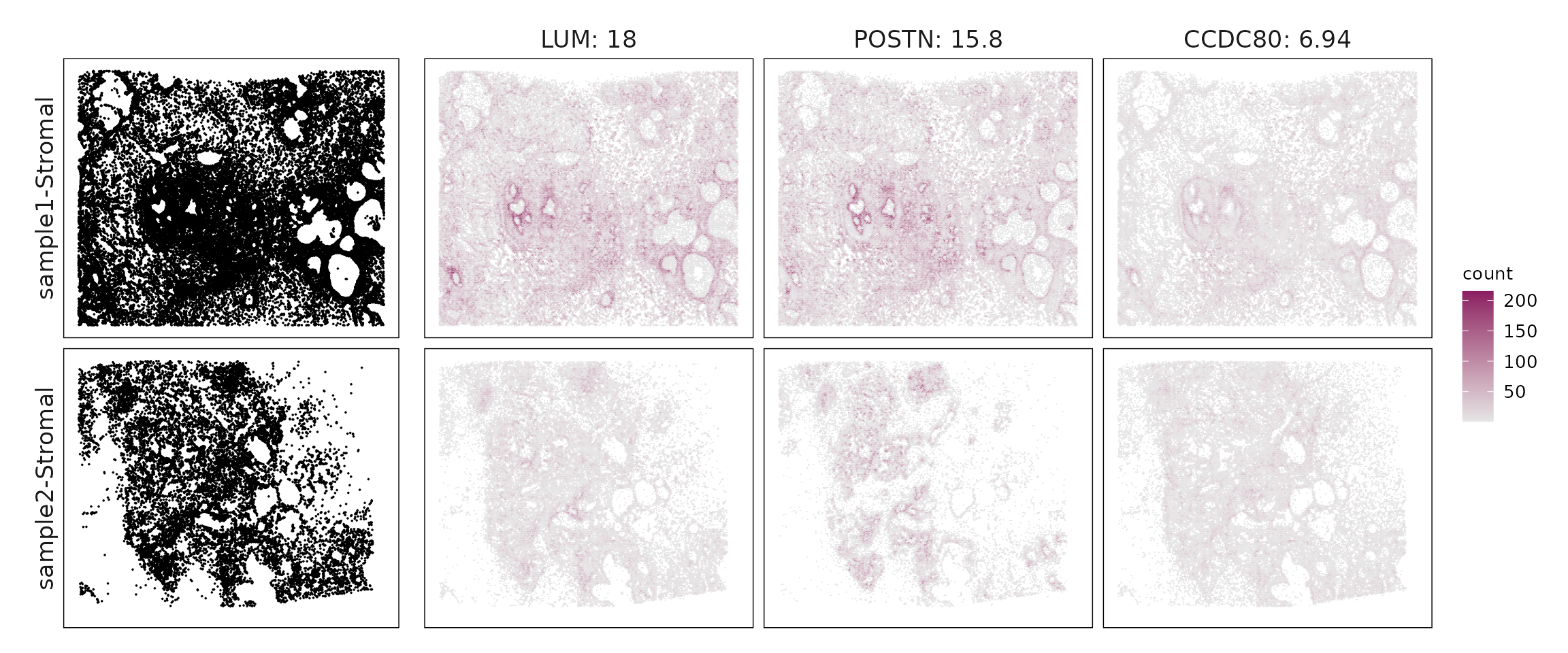
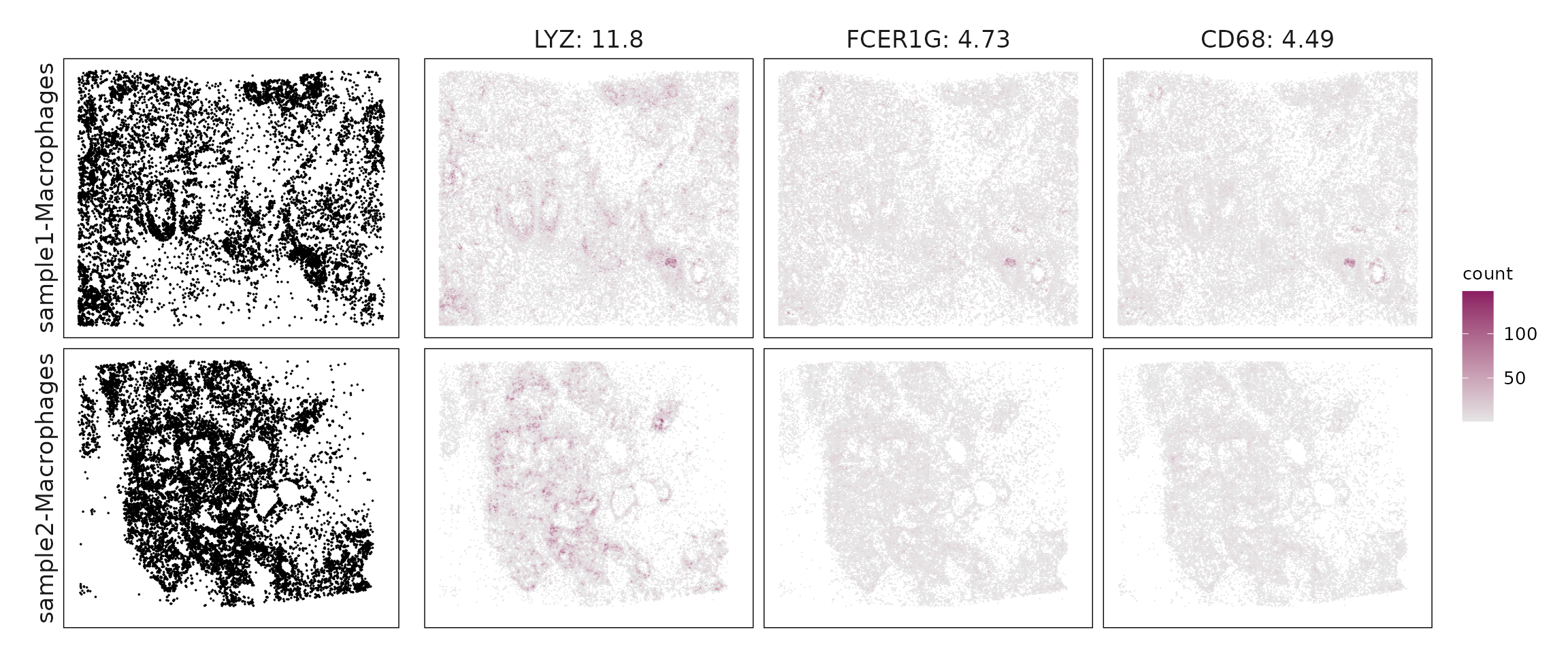
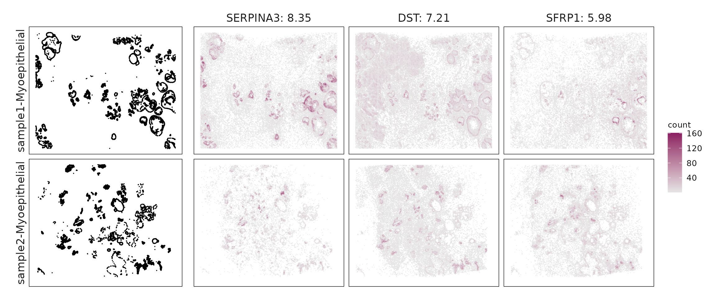
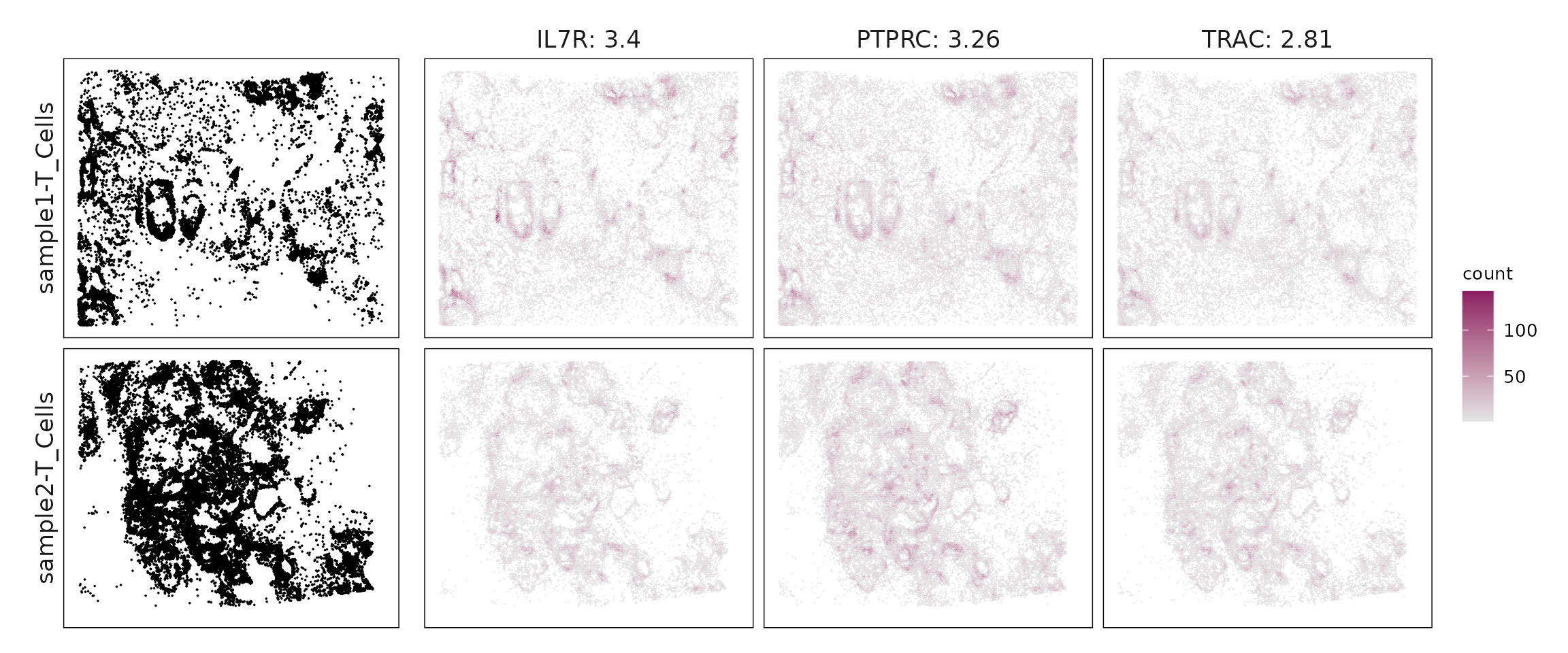
We visualized the top three marker genes identified by the linear modelling approach for each cluster. For each selected gene, its spatial transcript locations were plotted alongside the corresponding cluster map. Across clusters, the spatial expression patterns of marker genes closely match the distribution of their associated cell types
for (cl in cluster_names){
    ct_nm = anno_df[anno_df$cluster==cl, "anno_name"]
    inters=jazzPanda_res[jazzPanda_res$top_cluster==cl,"gene"]
    rounded_val=signif(as.numeric(jazzPanda_res[inters,"glm_coef"]),
                          digits = 3)
    inters_df = as.data.frame(cbind(gene=inters, value=rounded_val))
    inters_df$value = as.numeric(inters_df$value)
    inters_df=inters_df[order(inters_df$value, decreasing = TRUE),]
    inters_df$text= paste(inters_df$gene,inters_df$value,sep=": ")

    if (length(inters > 0)){
        inters_df = inters_df[1:min(3, nrow(inters_df)),]
        inters = inters_df$gene
        iters_sp1= sp1$trans_info$feature_name %in% inters
        vis_r1 =sp1$trans_info[iters_sp1,
                        c("x","y","feature_name")]
        vis_r1$value = inters_df[match(vis_r1$feature_name,inters_df$gene),
                        "value"]
        vis_r1$sample = "sample1"
        iters_sp2= sp2$trans_info$feature_name %in% inters
        vis_r2 =sp2$trans_info[iters_sp2,
                        c("x","y","feature_name")]
        vis_r2$value = inters_df[match(vis_r2$feature_name,inters_df$gene),
                        "value"]
        vis_r2$sample = "sample2"
        vis_df = rbind(vis_r1, vis_r2)
        vis_df$text_label= paste(vis_df$feature_name,
                            vis_df$value,sep=": ")
        vis_df$text_label=factor(vis_df$text_label, levels=inters_df$text)

        vis_df = vis_df[order(vis_df$text_label),]

        genes_plt<- ggplot(data = vis_df,
                    aes(x = x, y = y))+
                    scale_y_reverse()+
                    geom_hex(bins = auto_hex_bin(max(table(vis_df$sample,
                                                            vis_df$feature_name))))+
                    facet_grid(sample~text_label)+
                    scale_fill_gradient(low="grey90", high="maroon4") +
                    # scale_fill_viridis_c(option = "turbo")+
                    guides(fill = guide_colorbar(barheight = unit(0.2, "npc"),
                                                 barwidth  = unit(0.02, "npc")))+
                    defined_theme+ theme(legend.position = "right",
                              strip.background = element_rect(fill =NA,colour = NA),
                              strip.text = element_text(size = rel(1.2)),
                              strip.text.y.right = element_blank(),
                              legend.key.width = unit(2, "cm"),
                              fig_ratio=5/7,
                              legend.title = element_text(size = 10),
                              legend.text = element_text(size = 10),
                               legend.key.height = unit(2, "cm"))

        cluster_data =  cluster_info[cluster_info$cluster==cl, ]
        cluster_data$label = paste(cluster_data$sample, cluster_data$anno_name, sep="-")
        cluster_data$label =factor(cluster_data$label,
                                   levels=c(paste0("sample1-", ct_nm),
                                            paste0("sample2-",ct_nm )))
        cl_pt<- ggplot(data =cluster_data,
                    aes(x = x, y = y, color=sample))+
                    #geom_hex(bins = 100)+
                    geom_point(size=0.01)+
                    facet_wrap(~label, nrow=2,strip.position = "left")+
                    scale_y_reverse()+
                    scale_color_manual(values = c("black","black"))+
                    defined_theme +
            theme(legend.position = "none", fig_ratio=5/7,
                  strip.background = element_blank(),
                  legend.key.width = unit(15, "cm"),
                  strip.text = element_text(size = rel(1.2)))

        if (length(inters) == 2) {
            genes_plt <- (genes_plt | plot_spacer()) +
            plot_layout(widths = c(2, 1))
        } else if (length(inters) == 1) {
            genes_plt <- (genes_plt | plot_spacer() | plot_spacer()) +
            plot_layout(widths = c(1, 1, 1))
        }

        lyt <- wrap_plots(cl_pt, ncol = 1) | genes_plt
        layout_design <- lyt + patchwork::plot_layout(widths = c(1, 3))
        print(layout_design)
    }
  }
Cluster vector versus marker gene vector
We visualized the top three marker genes for each cluster by plotting their spatial gene vectors against the corresponding cluster vector. Each scatter plot shows how strongly each marker gene’s spatial pattern aligns with the overall spatial signal of its cluster, allowing assessment of both marker specificity and coherence with spatial domains.
Most top marker genes exhibit strong positive correlations with their corresponding cluster vectors, confirming good spatial alignment between gene expression and cluster structure. For instance, immune-related markers such as IL7R, PTPRC, and TRAC (c5) display distinct and compact expression patterns. Interestingly, for the Mast cell cluster, while sample 1 shows limited signal, sample 2 reveals a clear linear relationship between the cluster vector and marker gene vectors, suggesting that the model leverages information from sample 2 to identify reliable marker genes.
plot_lst=list()
for (cl in cluster_names){
    ct_nm = anno_df[anno_df$cluster==cl, "anno_name"]
    inters_df=jazzPanda_res[jazzPanda_res$top_cluster==cl,]

    if (nrow(inters_df) >0){
        inters_df=inters_df[order(inters_df$glm_coef, decreasing = TRUE),]

        inters_df = inters_df[1:min(3, nrow(inters_df)),]
        mk_genes = inters_df$gene
        dff = as.data.frame(cbind(sv_lst$cluster_mt[,cl],
                              sv_lst$gene_mt[,mk_genes]))
        colnames(dff) = c("cluster", mk_genes)
        dff$vector_id = c(1:nbins, 1:nbins)
        dff$sample= "sample1"
        dff[nbins:(2*nbins),"sample"] = "sample2"
        long_df <- dff %>%
         tidyr::pivot_longer(cols = -c(cluster, vector_id, sample), names_to = "gene",
               values_to = "vector_count")
        long_df$gene = factor(long_df$gene, levels=mk_genes)
        long_df$sample = factor(long_df$sample, levels=c("sample1", "sample2"))
        p<-ggplot(long_df, aes(x = cluster, y = vector_count, color=gene )) +
        geom_point(size=0.01) +
        facet_grid(sample~gene, scales="free_y") +
        labs(x = paste(ct_nm, " cluster vector ", sep=""),
         y = "Top3 marker gene vector") +
        theme_minimal()+
        scale_y_continuous(expand = c(0.01,0.01))+
        scale_x_continuous(expand =  c(0.01,0.01))+
        theme(panel.grid = element_blank(),legend.position = "none",
        strip.text = element_text(size = 12),
        axis.line=element_blank(),
        axis.text=element_text(size = 11),
        axis.ticks=element_line(color="black"),
        axis.title=element_text(size = 13),
        panel.border  =element_rect(colour = "black",
                                    fill=NA, linewidth=0.5)
        )

        if (length(mk_genes) == 2) {
            p <- (p | plot_spacer()) +
            plot_layout(widths = c(2, 1))
        } else if (length(mk_genes) == 1) {
            p <- (p | plot_spacer() | plot_spacer()) +
            plot_layout(widths = c(1, 1, 1))
        }

        plot_lst[[cl]] = p

    }

}
combined_plot <- wrap_plots(plot_lst, ncol = 2)

combined_plot 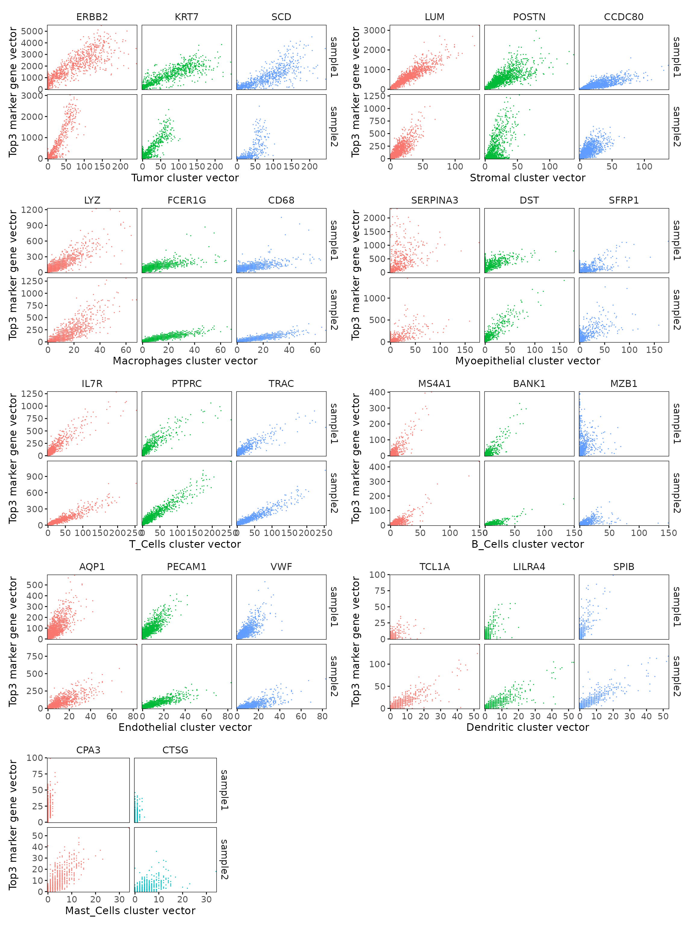
Marker gene summary per cluster
For each cluster, we summarized the detected marker genes and their corresponding strengths. We list genes with model coefficients above the defined cutoff (e.g. 0.1) for each cluster.
Tumor (c1) shows strong expression of ERBB2, EPCAM, GATA3, and FOXA1, consistent with a HER2-enriched luminal epithelial phenotype. The co-expression of CCND1 and AR indicates active cell-cycle and hormone signaling, characteristic of proliferative luminal tumors.
Stromal (c2) expresses LUM, POSTN, MMP2, and CXCL12, defining a cancer-associated fibroblast (CAF) population involved in extracellular matrix remodeling and tumor–stroma signaling.
Macrophages (c3) express LYZ, CD68, CD163, and MRC1, marking tumor-associated macrophages (TAMs) with an M2-like, immunoregulatory phenotype (HAVCR2, CD163).
Myoepithelial (c4) expresses KRT5, KRT14, and ACTA2, consistent with a basal/myoepithelial cell compartment, likely representing residual normal or basal-like tumor elements.
T Cells (c5) show CD3E, TRAC, CD8A, and CCR7, reflecting a mixed T-cell population with both cytotoxic and memory subsets.
B Cells (c6) express MS4A1, MZB1, and CD79A, representing mature and plasma B-cell states.
Endothelial (c7) expresses PECAM1, VWF, and KDR, marking vascular endothelial cells that form the tumor vasculature and support angiogenesis.
Dendritic (c8) expresses TCL1A and LILRA4, characteristic of plasmacytoid dendritic cells, while Mast Cells (c9) express CPA3 and CTSG, consistent with an activated mast cell population.
## linear modelling
output_data <- do.call(rbind, lapply(cluster_names, function(cl) {
  subset <- jazzPanda_res[jazzPanda_res$top_cluster == cl, ]
  ct_nm = anno_df[anno_df$cluster==cl, "anno_name"]
  cl_ct = paste0(cl," (",ct_nm, ")")
  sorted_subset <- subset[order(-subset$glm_coef), ]
  if (length(sorted_subset) == 0){
    return(data.frame(Cluster = cl_ct, Genes = "  "))
  }
  if (cl != "NoSig"){
    gene_list <- paste(sorted_subset$gene, "(", round(sorted_subset$glm_coef, 2), ")", sep="", collapse=", ")
  }else{
    gene_list <- paste(sorted_subset$gene, "", sep="", collapse=", ")
  }

  return(data.frame(Cluster = cl_ct, Genes = gene_list))
}))

knitr::kable(
  output_data,
  caption = "Detected marker genes for each cluster by linear modelling approach in jazzPanda, in decreasing value of glm coefficients"
)| Cluster | Genes |
|---|---|
| c1 (Tumor) | ERBB2(21.44), KRT7(13.48), SCD(12.03), EPCAM(9.52), FOXA1(8.41), CCND1(8.02), TACSTD2(7.87), GATA3(7.83), SERHL2(7.37), KRT8(6.89), ANKRD30A(6.7), FASN(5.94), MLPH(4.82), CDH1(4.47), CD9(4.19), ABCC11(4.18), CTTN(3.68), TPD52(3.5), CEACAM6(3.46), MDM2(3.27), TOMM7(3.13), NARS(3.07), TCIM(2.95), S100A14(2.61), ENAH(2.2), LYPD3(1.97), FLNB(1.95), CCDC6(1.93), MYO5B(1.81), ADAM9(1.7), SMS(1.68), HMGA1(1.52), RUNX1(1.42), TRAF4(1.41), AR(1.4), TENT5C(1.4), USP53(1.39), TMEM147(1.39), LARS(1.32), ACTG2(1.28), SH3YL1(1.27), TOP2A(1.26), QARS(1.16), JUP(1.15), ZNF562(1.15), SEC11C(1.14), TFAP2A(1.09), SEC24A(1.07), SQLE(1.07), VOPP1(1.05), SLC5A6(1.01), PCLAF(0.94), SRPK1(0.9), TRAPPC3(0.86), RHOH(0.79), FAM107B(0.79), KLF5(0.78), WARS(0.67), CENPF(0.66), TUBA4A(0.56), MYBPC1(0.55), CCPG1(0.5), SDC4(0.5), OCIAD2(0.49), KARS(0.46), AGR3(0.45), RTKN2(0.45), BACE2(0.44), PTRHD1(0.44), TRIB1(0.41), HOOK2(0.41), C6orf132(0.39), MUC6(0.38), MKI67(0.37), S100A8(0.36), EIF4EBP1(0.36), DNTTIP1(0.35), AQP3(0.35), HOXD8(0.34), DUSP5(0.27), ANKRD28(0.26), CXCL16(0.25), PELI1(0.25), TUBB2B(0.23), ALDH1A3(0.19), FSTL3(0.19), DMKN(0.19), THAP2(0.19), AKR1C1(0.18), STC1(0.18), MAP3K8(0.18), LGALSL(0.17), TIFA(0.16), DAPK3(0.15), PPARG(0.14), RORC(0.14), CEACAM8(0.13), APOBEC3B(0.11), HPX(0.11), C2orf42(0.1) |
| c2 (Stromal) | LUM(18), POSTN(15.8), CCDC80(6.94), CXCL12(6.45), MMP2(5.11), SFRP4(3.12), PTGDS(2.81), PDGFRB(2.56), ZEB2(2.44), FBLN1(2.38), PDGFRA(2.18), BASP1(1.8), ITM2C(1.66), CRISPLD2(1.62), IGF1(1.28), S100A4(1.23), ZEB1(1.19), TCF4(1.07), PDK4(1.03), PRDM1(0.98), GJB2(0.96), LRRC15(0.87), ERN1(0.82), DPT(0.75), GLIPR1(0.72), PIM1(0.44), RAB30(0.36), PDE4A(0.32), TCEAL7(0.16), FAM49A(0.16), CCL8(0.11) |
| c3 (Macrophages) | LYZ(11.84), FCER1G(4.73), CD68(4.49), CD4(4.02), FGL2(2.97), AIF1(2.82), APOC1(2.41), IGSF6(2), ITGAX(1.91), CD163(1.83), SLAMF7(1.55), C1QC(1.4), MRC1(1.39), HAVCR2(1.23), MNDA(1.07), CD14(0.98), FCGR3A(0.97), C15orf48(0.97), MMP12(0.94), CD83(0.93), C1QA(0.92), MMP1(0.88), CD86(0.85), ITGAM(0.52), FCER1A(0.49), TPSAB1(0.27), LY86(0.25), PDCD1LG2(0.25), CD80(0.12), CLEC9A(0.12) |
| c4 (Myoepithelial) | SERPINA3(8.35), DST(7.21), SFRP1(5.98), MYLK(5.9), ACTA2(5.07), KRT14(4.65), PTN(3.86), KRT5(3.39), DSP(3.01), MYH11(2.47), KRT6B(1.99), DSC2(1.9), SVIL(1.73), KRT23(1.21), ESR1(1.15), KIT(1.1), EGFR(0.93), PIGR(0.8), OPRPN(0.68), SLC25A37(0.66), OXTR(0.37), PGR(0.33), C5orf46(0.29), CDC42EP1(0.25), CX3CR1(0.22), FOXC2(0.18), SCGB2A1(0.13) |
| c5 (T_Cells) | IL7R(3.4), PTPRC(3.26), TRAC(2.81), CD3E(2.77), CXCR4(2.69), CD8A(1.25), CCL5(1.24), IL2RG(1.23), CYTIP(0.99), KLRB1(0.83), LDHB(0.83), CD3G(0.75), GZMA(0.72), GPR183(0.72), CCR7(0.7), CD69(0.7), SERPINB9(0.65), TCF7(0.64), CD247(0.64), SELL(0.62), SMAP2(0.59), ADGRE5(0.47), LPXN(0.46), CTLA4(0.43), LTB(0.43), SLAMF1(0.4), TIGIT(0.35), KLRD1(0.26), NKG7(0.26), CD27(0.25), DUSP2(0.2), PRF1(0.19), KLRC1(0.18), GNLY(0.18) |
| c6 (B_Cells) | MS4A1(2.55), BANK1(1.58), MZB1(1.57), CD79A(0.94), CD19(0.46), TNFRSF17(0.4), CD79B(0.24), CLECL1(0.18) |
| c7 (Endothelial) | AQP1(7.37), PECAM1(4.92), VWF(4.89), CD93(3.7), CAV1(3.01), CLEC14A(1.91), RAMP2(1.52), MMRN2(1.52), KDR(1.21), ADH1B(0.84), NOSTRIN(0.75), ANKRD29(0.7), HOXD9(0.67), RAPGEF3(0.65), ANGPT2(0.64), EGFL7(0.56), IL3RA(0.54), SOX17(0.53), CAVIN2(0.45), AVPR1A(0.35), SOX18(0.26), SNAI1(0.24), LPL(0.17), TIMP4(0.12) |
| c8 (Dendritic) | TCL1A(1.88), LILRA4(1.75), SPIB(1.48), PLD4(0.83) |
| c9 (Mast_Cells) | CPA3(1.95), CTSG(0.75) |
Wilcoxon Rank Sum Test
The FindAllMarkers function applies a Wilcoxon Rank Sum
test to detect genes with cluster-specific expression shifts. Only
positive markers (upregulated genes) were retained using a log
fold-change threshold of 0.1
set.seed(1939)
cm_new1=sp1$cm[,setdiff(colnames(sp1$cm),c(sp1$zero_cells,"cate"))]
colnames(cm_new1)=paste(colnames(cm_new1),"_1", sep="")
biorep1=factor(rep(c("hb1"),c(ncol(cm_new1))))
names(biorep1) = colnames(cm_new1)

sp1_seu=CreateSeuratObject(counts = cm_new1, project = "hb1")
sp1_seu=AddMetaData(object=sp1_seu, metadata = biorep1, col.name="biorep")
DefaultAssay(sp1_seu) <- 'RNA'
sp1_seu = NormalizeData(sp1_seu,normalization.method ="LogNormalize")
sp1_seu = FindVariableFeatures(sp1_seu, selection.method = "vst",
                               nfeatures = nrow(sp1$cm), verbose = FALSE)

sp1_seu=ScaleData(sp1_seu)

sp1_seu=RunPCA(sp1_seu, npcs = 50, verbose = FALSE)

set.seed(1939)
cm_sp2=sp2$cm[,setdiff(colnames(sp2$cm),c(sp2$zero_cells,"cate"))]
colnames(cm_sp2)=paste(colnames(cm_sp2),"_2", sep="")
biosp2=factor(rep(c("hb2"),c(ncol(cm_sp2))))
names(biosp2) = colnames(cm_sp2)
sp2_seu=CreateSeuratObject(counts = cm_sp2, project = "hb2")
sp2_seu=AddMetaData(object=sp2_seu, metadata = biosp2, col.name="biorep")
DefaultAssay(sp2_seu) <- 'RNA'
sp2_seu <- NormalizeData(sp2_seu,normalization.method ="LogNormalize")
sp2_seu = FindVariableFeatures(sp2_seu, selection.method = "vst",
                               nfeatures = nrow(sp2$cm), verbose = FALSE)

sp2_seu <- ScaleData(sp2_seu)
sp2_seu=RunPCA(sp2_seu, npcs = 50, verbose = FALSE)

merged_seu = Merge_Seurat_List(
    list(sp1_seu[shared_genes,], sp2_seu[shared_genes,]),
    # add.cell.ids = c(),
    merge.data = FALSE,
    project = "hbreast"
)
Idents(merged_seu) = cluster_info$cluster

# re-join layers after integration
merged_seu[["RNA"]] <- JoinLayers(merged_seu[["RNA"]])

VariableFeatures(merged_seu) <- row.names(merged_seu)
merged_seu <- ScaleData(merged_seu, features = row.names(merged_seu),
                        verbose = FALSE)
set.seed(1939)
# print(ElbowPlot(merged_seu, ndims = 50))
merged_seu <- RunPCA(merged_seu, features = row.names(merged_seu),
                     npcs = 50, verbose = FALSE)
merged_seu <- RunUMAP(merged_seu, dims = 1:20, verbose = FALSE)


FM_res <- FindAllMarkers(merged_seu, only.pos = TRUE,logfc.threshold = 0.1)

saveRDS(merged_seu, here(gdata,paste0(data_nm, "_seu.Rds")))
saveRDS(FM_res, here(gdata,paste0(data_nm, "_seu_markers.Rds")))
FM_result= readRDS(here(gdata,paste0(data_nm, "_seu_markers.Rds")))
FM_result = FM_result[FM_result$avg_log2FC>0.1, ]
table(FM_result$cluster)
c1 c3 c2 c4 c5 c7 c9 c6 c8
78 71 55 71 82 75 80 87 76
FM_result$cluster <- factor(FM_result$cluster,
levels = cluster_names)
top_mg <- FM_result %>%
group_by(cluster) %>%
arrange(desc(avg_log2FC), .by_group = TRUE) %>%
slice_max(order_by = avg_log2FC, n = 10) %>%
select(cluster, gene, avg_log2FC)
p1<-DotPlot(seu, features = unique(top_mg$gene)) +
scale_colour_gradient(low = "white", high = "red") +
coord_flip()+
theme(axis.text.x = element_text(angle = 45, hjust = 1, vjust = 1))+
labs(title = "Top 10 marker genes (WRS)", x="", y="")
p1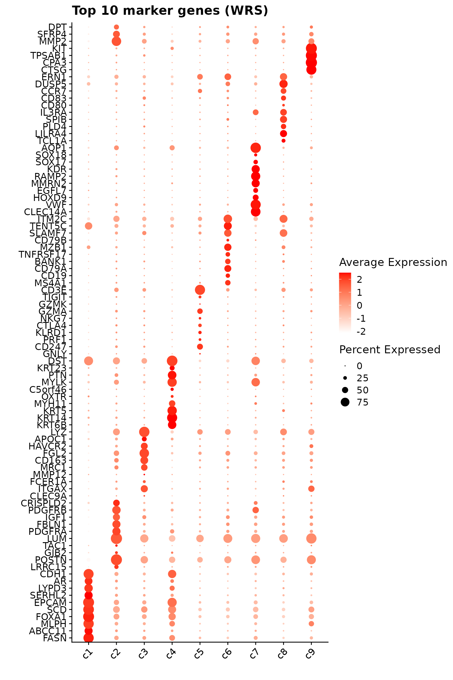
limma
We applied the limma framework to identify differentially expressed marker genes across clusters in the healthy liver sample. Count data were normalized using log-transformed counts from the speckle package. A linear model was fitted for each gene with cluster identity as the design factor, and pairwise contrasts were constructed to compare each cluster against all others. Empirical Bayes moderation was applied to stabilize variance estimates, and significant genes were determined using the moderated t-statistics from eBayes.
cm_new1=sp1$cm[,setdiff(colnames(sp1$cm),c(sp1$zero_cells,"cate"))]
colnames(cm_new1)=paste(colnames(cm_new1),"_1", sep="")
biorep1=factor(rep(c("hb1"),c(ncol(cm_new1))))
names(biorep1) = colnames(cm_new1)

cm_sp2=sp2$cm[,setdiff(colnames(sp2$cm),c(sp2$zero_cells,"cate"))]
colnames(cm_sp2)=paste(colnames(cm_sp2),"-sp2", sep="")
biosp2=factor(rep(c("hb2"),c(ncol(cm_sp2))))
names(biosp2) = colnames(cm_sp2)

rep_clusters = cluster_info
y=DGEList(cbind(cm_new1[shared_genes,intersect(colnames(cm_new1),rep_clusters$cells)], cm_sp2[shared_genes,intersect(colnames(cm_sp2),rep_clusters$cells)]))
sample=c(biorep1[intersect(colnames(cm_new1),rep_clusters$cells)],biosp2[intersect(colnames(cm_sp2),rep_clusters$cells)])
logcounts.all <- normCounts(y,log=TRUE,prior.count=0.1)
all.ct <- factor(rep_clusters$cluster)

design <- model.matrix(~0+all.ct+sample)
colnames(design)[1:(length(levels(all.ct)))] <- levels(all.ct)

mycont <- matrix(0,ncol=length(levels(all.ct)),nrow=length(levels(all.ct)))
colnames(mycont)<-levels(all.ct)
diag(mycont)<-1
mycont[upper.tri(mycont)]<- -1/(length(levels(all.ct))-1)
mycont[lower.tri(mycont)]<- -1/(length(levels(all.ct))-1)

# Fill out remaining rows with 0s
zero.rows <- matrix(0,ncol=length(levels(all.ct)),nrow=(ncol(design)-length(levels(all.ct))))
test <- rbind(mycont,zero.rows)

fit <- lmFit(logcounts.all,design)
fit.cont <- contrasts.fit(fit,contrasts=test)
fit.cont <- eBayes(fit.cont,trend=TRUE,robust=TRUE)

fit.cont$genes <- shared_genes
limma_dt<-decideTests(fit.cont)

saveRDS(fit.cont, here(gdata,paste0(data_nm, "_fit_cont_obj.Rds")))
fit.cont = readRDS(here(gdata,paste0(data_nm, "_fit_cont_obj.Rds")))
limma_dt <- decideTests(fit.cont)
summary(limma_dt) c1 c2 c3 c4 c5 c6 c7 c8 c9
Down 171 154 200 166 221 182 176 186 170
NotSig 2 18 4 13 3 19 10 21 44
Up 107 108 76 101 56 79 94 73 66top_markers <- lapply(cluster_names, function(cl) {
tt <- topTable(fit.cont,
coef = cl,
number = Inf,
adjust.method = "BH",
sort.by = "P")
tt <- tt[order(tt$adj.P.Val, -abs(tt$logFC)), ]
tt$contrast <- cl
tt$gene <- rownames(tt)
head(tt, 10)
})
# Combine into one data.frame
top_markers_df <- bind_rows(top_markers) %>%
select(contrast, gene, logFC, adj.P.Val)
p1<- DotPlot(seu, features = unique(top_markers_df$gene)) +
scale_colour_gradient(low = "white", high = "red") +
coord_flip()+
theme(axis.text.x = element_text(angle = 45, hjust = 1, vjust = 1))+
labs(title = "Top 10 marker genes (limma)", x="", y="")
p1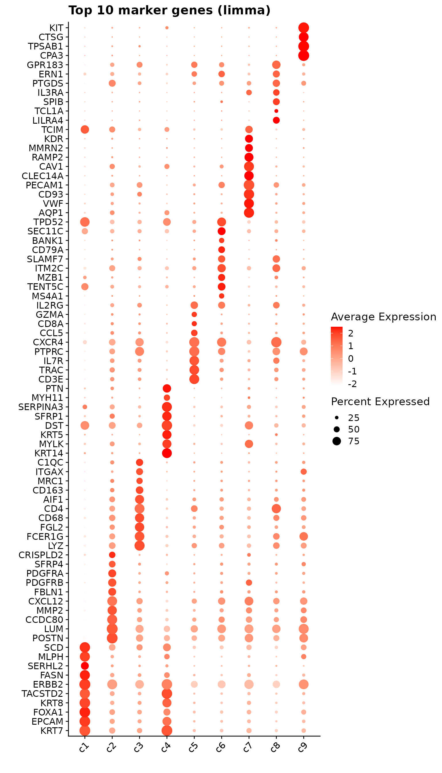
Comparison of marker gene detection methods
Cumulative rank plot
We compared the performance of different marker detection methods — jazzPanda (linear modelling), limma, and Seurat’s Wilcoxon Rank Sum test — by evaluating the cumulative average spatial correlation between ranked marker genes and their corresponding target clusters at the spatial vector level.
plot_lst=list()
cor1 <- cor(sv_lst$gene_mt[1:1600, ],
            sv_lst$cluster_mt[1:1600, paste0("c", 1:9)], method = "spearman")

cor2 <- cor(sv_lst$gene_mt[1600:3200, ],
            sv_lst$cluster_mt[1600:3200, paste0("c", 1:9)], method = "spearman")

cor_M <-(cor1 + cor2) / 2

Idents(seu)=cluster_info$cluster[match(colnames(seu),
                                       cluster_info$cells)]
for (cl in cluster_names){
    ct_nm = anno_df[anno_df$cluster==cl, "anno_name"]

    fm_cl=FindMarkers(seu, ident.1 = cl, only.pos = TRUE,
            logfc.threshold = 0.1)
    fm_cl = fm_cl[fm_cl$p_val_adj<0.05, ]
    fm_cl = fm_cl[order(fm_cl$avg_log2FC, decreasing = TRUE),]
    to_plot_fm =row.names(fm_cl)
    if (length(to_plot_fm)>0){
       FM_pt = data.frame("name"=to_plot_fm,"rk"= 1:length(to_plot_fm),
                       "y"= get_cmr_ma(to_plot_fm,cor_M = cor_M, cl = cl),
                       "type"="Wilcoxon Rank Sum Test")
    }else{
        FM_pt <- data.frame(name = character(0), rk = integer(0),
                               y= numeric(0), type = character(0))
    }

    limma_cl<-topTable(fit.cont,coef=cl,p.value = 0.05, n=Inf, sort.by = "p")
    limma_cl = limma_cl[limma_cl$logFC>0, ]
    to_plot_lm = row.names(limma_cl)
    if (length(to_plot_lm)>0){
       limma_pt = data.frame("name"=to_plot_lm,"rk"= 1:length(to_plot_lm),
                      "y"= get_cmr_ma(to_plot_lm,cor_M = cor_M, cl = cl),
                      "type"="limma")
    }else{
        limma_pt <- data.frame(name = character(0), rk = integer(0),
                               y= numeric(0), type = character(0))
    }


    lasso_sig = jazzPanda_res[jazzPanda_res$top_cluster==cl,]
    if (nrow(lasso_sig) > 0) {
        lasso_sig <- lasso_sig[order(lasso_sig$glm_coef, decreasing = TRUE), ]
        lasso_pt = data.frame("name"=lasso_sig$gene,"rk"= 1:nrow(lasso_sig),
                          "y"= get_cmr_ma(lasso_sig$gene,cor_M = cor_M, cl = cl),
                          "type"="jazzPanda-glm")

    } else {
      lasso_pt <- data.frame(name = character(0), rk = integer(0),
                               y= numeric(0), type = character(0))
    }

    data_lst = rbind(limma_pt, FM_pt,lasso_pt)

    data_lst$type <- factor(
        data_lst$type,
        levels = c("jazzPanda-glm", "limma", "Wilcoxon Rank Sum Test")
    )
    data_lst$rk = as.numeric(data_lst$rk)
    p <-ggplot(data_lst, aes(x = rk, y = y, color = type)) +
        geom_step(size = 0.8) +  # type = "s"
        scale_color_manual(values = c("jazzPanda-glm" = "red",
                                      "limma" = "black",
                                      "Wilcoxon Rank Sum Test" = "blue")) +
        labs(title = ct_nm, x = "Rank of marker genes",
             y = "Cumulative average correlation",
             color = NULL) +
        scale_x_continuous(limits = c(0, 50))+
        theme_classic(base_size = 12) +
        theme(plot.title = element_text(hjust = 0.5),
            axis.line = element_blank(),
            panel.border = element_rect(color = "black",
                                        fill = NA, linewidth = 1),
            legend.position = "inside",
            legend.position.inside = c(0.98, 0.02),
            legend.justification = c("right", "bottom"),
            legend.background = element_rect(color = "black",
                                             fill = "white", linewidth = 0.5),
            legend.box.background = element_rect(color = "black",
                                                 linewidth = 0.5)
        )
    plot_lst[[cl]] <- p
}


combined_plot <- wrap_plots(plot_lst, ncol = 3)

combined_plot 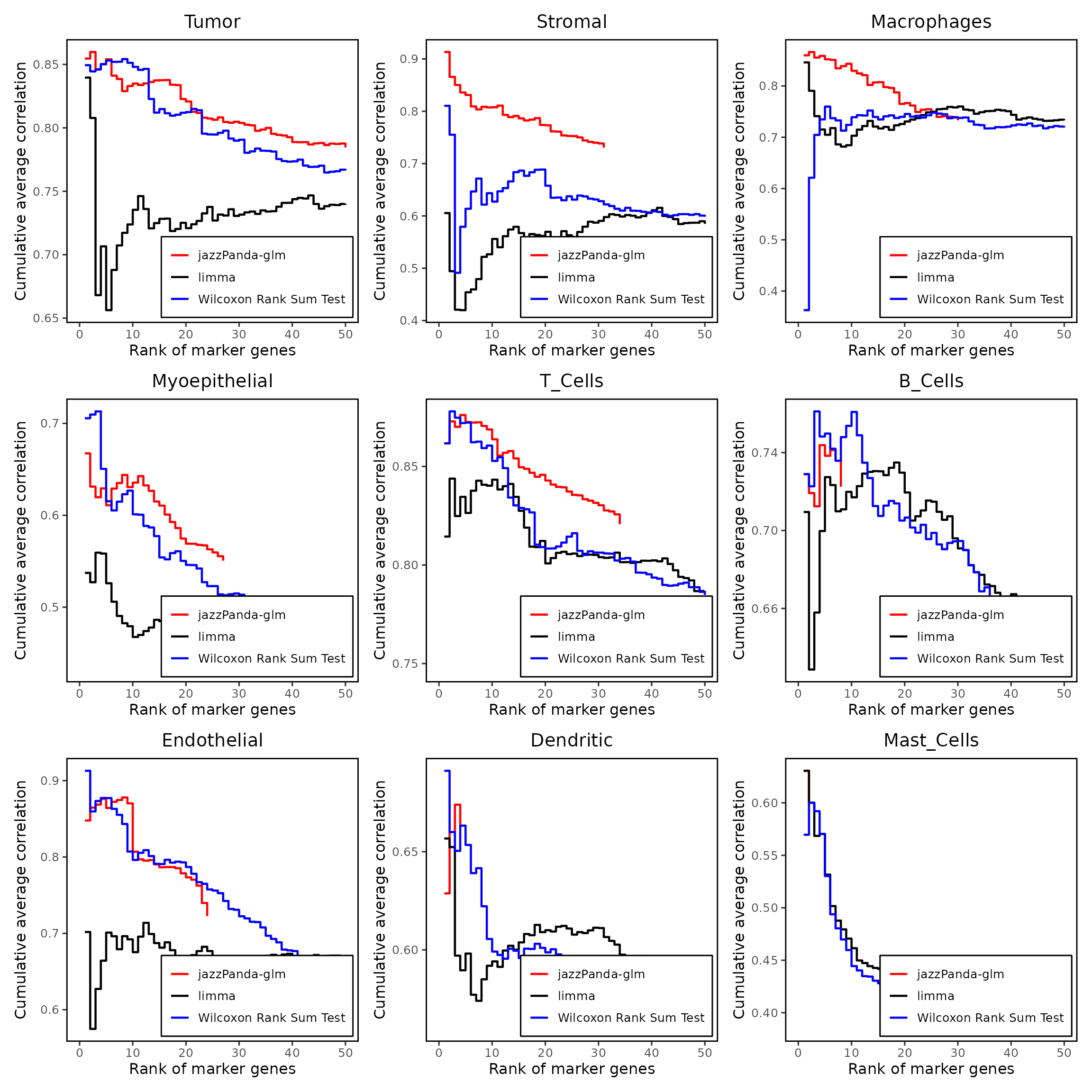
Upset plot
We further visualized the overlap between marker genes detected by the four methods using UpSet plots for each cluster. There is some overlap among methods; however, limma and the Wilcoxon rank sum test identify substantially more marker genes, many of which are not spatially relevant to the clusters. Marker genes for Tumor and T-cell clusters show greater consistency and overlap across methods.
plot_lst=list()
for (cl in cluster_names){
    ct_nm = anno_df[anno_df$cluster==cl, "anno_name"]
    findM_sig <- FM_result[FM_result$cluster==cl & FM_result$p_val_adj<0.05,"gene"]
    limma_sig <- row.names(limma_dt[limma_dt[,cl]==1,])
    lasso_cl <- jazzPanda_res[jazzPanda_res$top_cluster==cl, "gene"]

    df_mt <- as.data.frame(matrix(FALSE,nrow=nrow(jazzPanda_res),ncol=3))
    row.names(df_mt) <- jazzPanda_res$gene
    colnames(df_mt) <- c("jazzPanda-glm",
                      "Wilcoxon Rank Sum Test","limma")
    df_mt[findM_sig,"Wilcoxon Rank Sum Test"] <- TRUE
    df_mt[limma_sig,"limma"] <- TRUE
    df_mt[lasso_cl,"jazzPanda-glm"] <- TRUE

    df_mt$gene_name <- row.names(df_mt)

    p = upset(df_mt,
               intersect=c("Wilcoxon Rank Sum Test", "limma",
                           "jazzPanda-glm"),
               wrap=TRUE, keep_empty_groups= FALSE, name="",
               #themes=theme_grey(),
               stripes='white',
               sort_intersections_by ="cardinality", sort_sets= FALSE,min_degree=1,
               set_sizes =(
                   upset_set_size()
                   + theme(axis.title= element_blank(),
                           axis.ticks.y = element_blank(),
                           axis.text.y = element_blank())),
               sort_intersections= "descending", warn_when_converting=FALSE,
               warn_when_dropping_groups=TRUE,encode_sets=TRUE,

               width_ratio=0.3, height_ratio=1/4)+
              ggtitle(ct_nm)+
                 theme(plot.title = element_text( size=15))
        plot_lst[[cl]] <- p
}

combined_plot <- wrap_plots(plot_lst, ncol = 3)

combined_plot 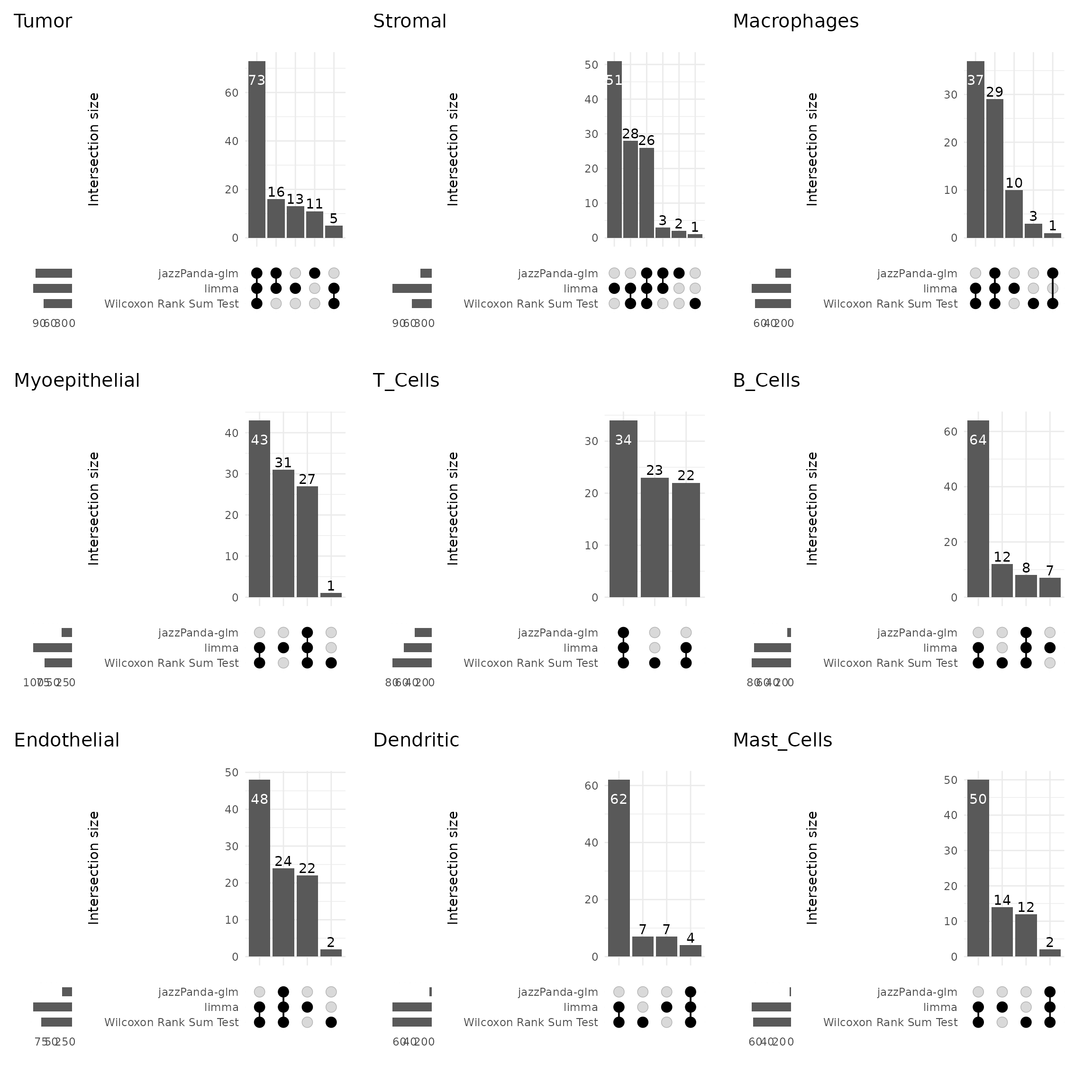
sessionInfo()R version 4.5.1 (2025-06-13)
Platform: x86_64-pc-linux-gnu
Running under: Red Hat Enterprise Linux 9.3 (Plow)
Matrix products: default
BLAS: /stornext/System/data/software/rhel/9/base/tools/R/4.5.1/lib64/R/lib/libRblas.so
LAPACK: /stornext/System/data/software/rhel/9/base/tools/R/4.5.1/lib64/R/lib/libRlapack.so; LAPACK version 3.12.1
locale:
[1] LC_CTYPE=en_AU.UTF-8 LC_NUMERIC=C
[3] LC_TIME=en_AU.UTF-8 LC_COLLATE=en_AU.UTF-8
[5] LC_MONETARY=en_AU.UTF-8 LC_MESSAGES=en_AU.UTF-8
[7] LC_PAPER=en_AU.UTF-8 LC_NAME=C
[9] LC_ADDRESS=C LC_TELEPHONE=C
[11] LC_MEASUREMENT=en_AU.UTF-8 LC_IDENTIFICATION=C
time zone: Australia/Melbourne
tzcode source: system (glibc)
attached base packages:
[1] stats4 stats graphics grDevices utils datasets methods
[8] base
other attached packages:
[1] dotenv_1.0.3 here_1.0.1
[3] speckle_1.8.0 edgeR_4.6.3
[5] limma_3.64.1 RColorBrewer_1.1-3
[7] patchwork_1.3.1 gridExtra_2.3
[9] corrplot_0.95 ComplexUpset_1.3.3
[11] caret_7.0-1 lattice_0.22-7
[13] glmnet_4.1-10 Matrix_1.7-3
[15] dplyr_1.1.4 data.table_1.17.8
[17] ggplot2_3.5.2 Seurat_5.3.0
[19] SeuratObject_5.1.0 sp_2.2-0
[21] SpatialExperiment_1.18.1 SingleCellExperiment_1.30.1
[23] SummarizedExperiment_1.38.1 Biobase_2.68.0
[25] GenomicRanges_1.60.0 GenomeInfoDb_1.44.2
[27] IRanges_2.42.0 S4Vectors_0.46.0
[29] BiocGenerics_0.54.0 generics_0.1.4
[31] MatrixGenerics_1.20.0 matrixStats_1.5.0
[33] jazzPanda_0.2.4 spatstat_3.4-0
[35] spatstat.linnet_3.3-1 spatstat.model_3.4-0
[37] rpart_4.1.24 spatstat.explore_3.5-2
[39] nlme_3.1-168 spatstat.random_3.4-1
[41] spatstat.geom_3.5-0 spatstat.univar_3.1-4
[43] spatstat.data_3.1-8
loaded via a namespace (and not attached):
[1] RcppAnnoy_0.0.22 splines_4.5.1 later_1.4.2
[4] R.oo_1.27.1 tibble_3.3.0 polyclip_1.10-7
[7] hardhat_1.4.2 pROC_1.19.0.1 fastDummies_1.7.5
[10] lifecycle_1.0.4 rprojroot_2.1.0 globals_0.18.0
[13] MASS_7.3-65 magrittr_2.0.3 plotly_4.11.0
[16] sass_0.4.10 rmarkdown_2.29 jquerylib_0.1.4
[19] yaml_2.3.10 httpuv_1.6.16 sctransform_0.4.2
[22] spam_2.11-1 spatstat.sparse_3.1-0 reticulate_1.43.0
[25] cowplot_1.2.0 pbapply_1.7-4 lubridate_1.9.4
[28] abind_1.4-8 Rtsne_0.17 presto_1.0.0
[31] R.utils_2.13.0 purrr_1.1.0 BumpyMatrix_1.16.0
[34] nnet_7.3-20 ipred_0.9-15 lava_1.8.1
[37] GenomeInfoDbData_1.2.14 ggrepel_0.9.6 irlba_2.3.5.1
[40] listenv_0.9.1 spatstat.utils_3.1-5 goftest_1.2-3
[43] RSpectra_0.16-2 fitdistrplus_1.2-4 parallelly_1.45.1
[46] codetools_0.2-20 DelayedArray_0.34.1 tidyselect_1.2.1
[49] shape_1.4.6.1 UCSC.utils_1.4.0 farver_2.1.2
[52] jsonlite_2.0.0 progressr_0.15.1 ggridges_0.5.6
[55] survival_3.8-3 iterators_1.0.14 systemfonts_1.3.1
[58] foreach_1.5.2 tools_4.5.1 ragg_1.5.0
[61] ica_1.0-3 Rcpp_1.1.0 glue_1.8.0
[64] prodlim_2025.04.28 SparseArray_1.8.1 xfun_0.52
[67] mgcv_1.9-3 withr_3.0.2 fastmap_1.2.0
[70] digest_0.6.37 timechange_0.3.0 R6_2.6.1
[73] mime_0.13 textshaping_1.0.1 colorspace_2.1-1
[76] scattermore_1.2 tensor_1.5.1 R.methodsS3_1.8.2
[79] hexbin_1.28.5 tidyr_1.3.1 recipes_1.3.1
[82] class_7.3-23 httr_1.4.7 htmlwidgets_1.6.4
[85] S4Arrays_1.8.1 uwot_0.2.3 ModelMetrics_1.2.2.2
[88] pkgconfig_2.0.3 gtable_0.3.6 timeDate_4041.110
[91] lmtest_0.9-40 XVector_0.48.0 htmltools_0.5.8.1
[94] dotCall64_1.2 scales_1.4.0 png_0.1-8
[97] gower_1.0.2 knitr_1.50 reshape2_1.4.4
[100] rjson_0.2.23 cachem_1.1.0 zoo_1.8-14
[103] stringr_1.5.1 KernSmooth_2.23-26 parallel_4.5.1
[106] miniUI_0.1.2 pillar_1.11.0 grid_4.5.1
[109] vctrs_0.6.5 RANN_2.6.2 promises_1.3.3
[112] xtable_1.8-4 cluster_2.1.8.1 evaluate_1.0.4
[115] magick_2.8.7 locfit_1.5-9.12 cli_3.6.5
[118] compiler_4.5.1 rlang_1.1.6 crayon_1.5.3
[121] future.apply_1.20.0 labeling_0.4.3 plyr_1.8.9
[124] stringi_1.8.7 viridisLite_0.4.2 deldir_2.0-4
[127] BiocParallel_1.42.1 lazyeval_0.2.2 RcppHNSW_0.6.0
[130] bit64_4.6.0-1 future_1.67.0 statmod_1.5.0
[133] shiny_1.11.1 ROCR_1.0-11 igraph_2.1.4
[136] bslib_0.9.0 bit_4.6.0